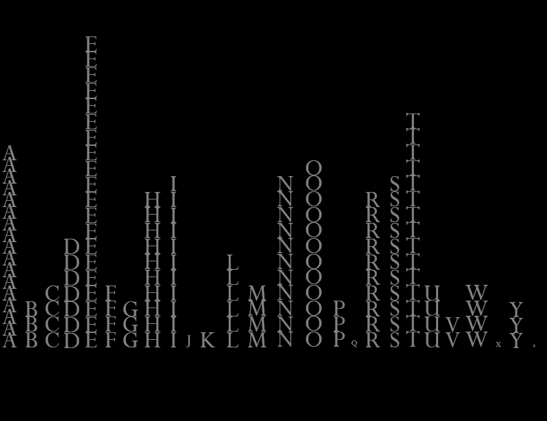
The idea was to take the frequency of each letter and try to turn it into a city skyline
2 thoughts on “Alphabet Soup WIP”
Nice design. Love the scale, value and arrangement in this, plus the fact that you kept the letters in order. The font choice also has a nice structural quality.
My only gripe is with the stacked A column on the left. A little tight to the border.
I like your concept and how you translated that visually. Your graphic is great, but your use of border is kind of awkward to me with the difference in space around your A and Z, as well as how the E stack is closer to the top than everything else is to the bottom.