
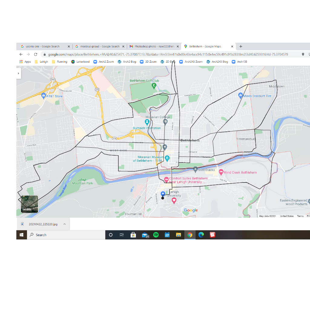
1- Map with all my most commonly run roads in Bethlehem marked 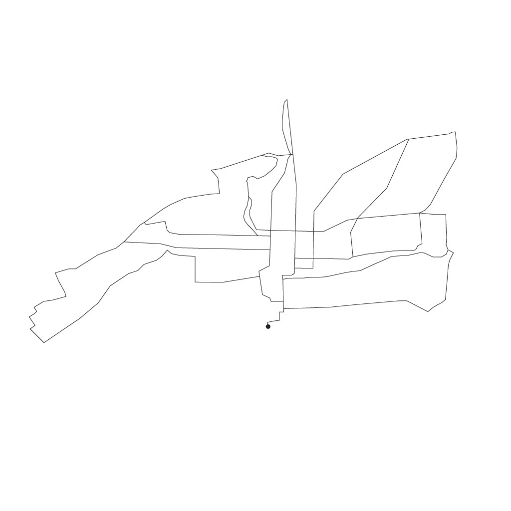
2 – Isolating the most commonly run roads into a shape 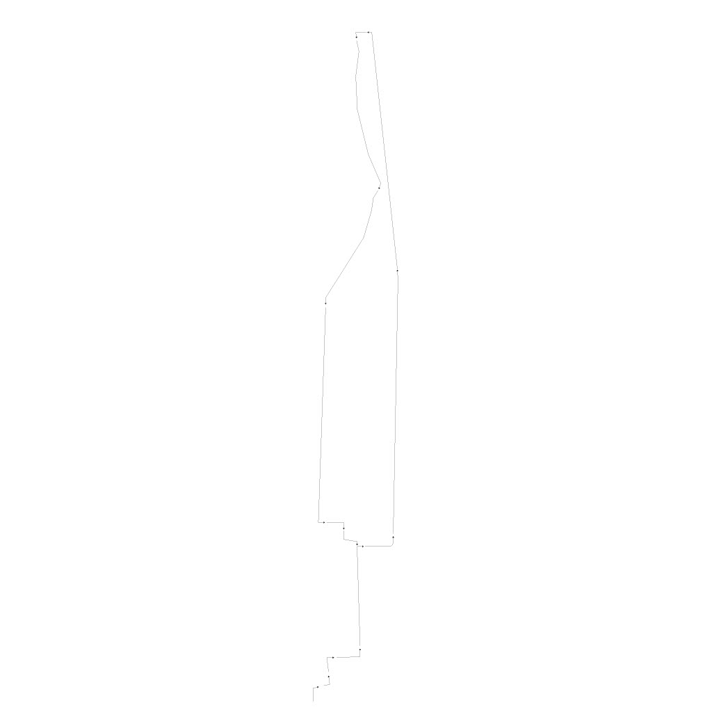
3 – Experimenting with arrows / directionality on the most commonly run route of them all
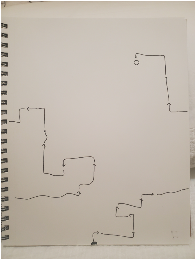
4 – Blind “contour” of my route from my house, through Farington, on the greenway, through the Steelstacks, and back home 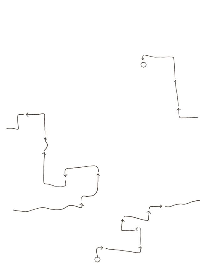
5 – Thought this was really nice, contemplated submitting 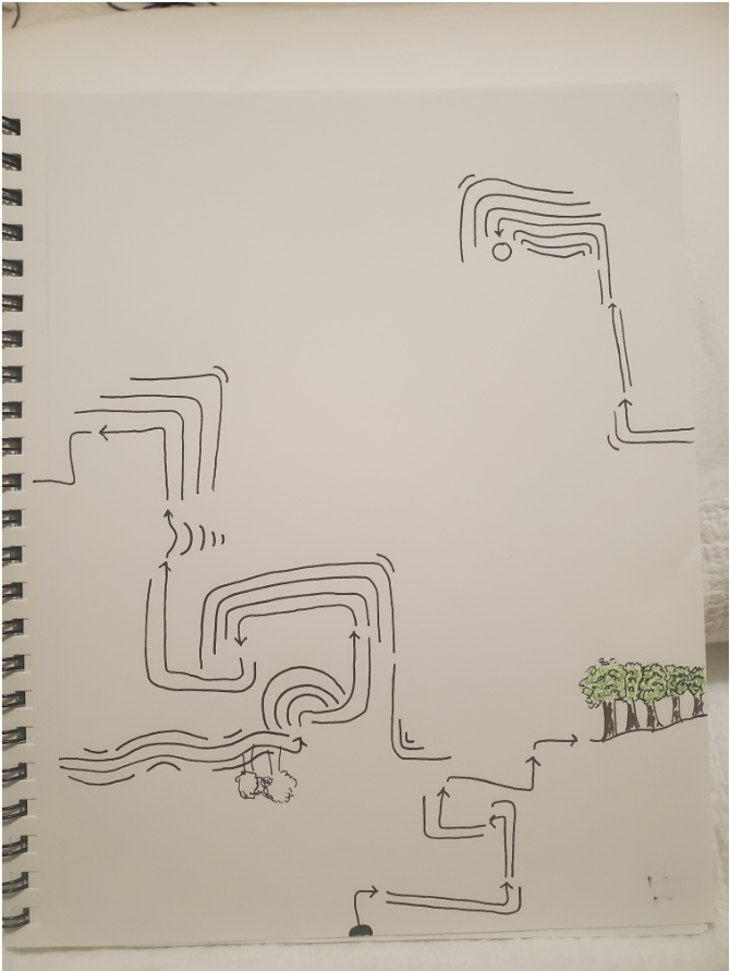
6 – Adding lines to create rhythm and visual interest (and ultimately making the mistake of adding trees 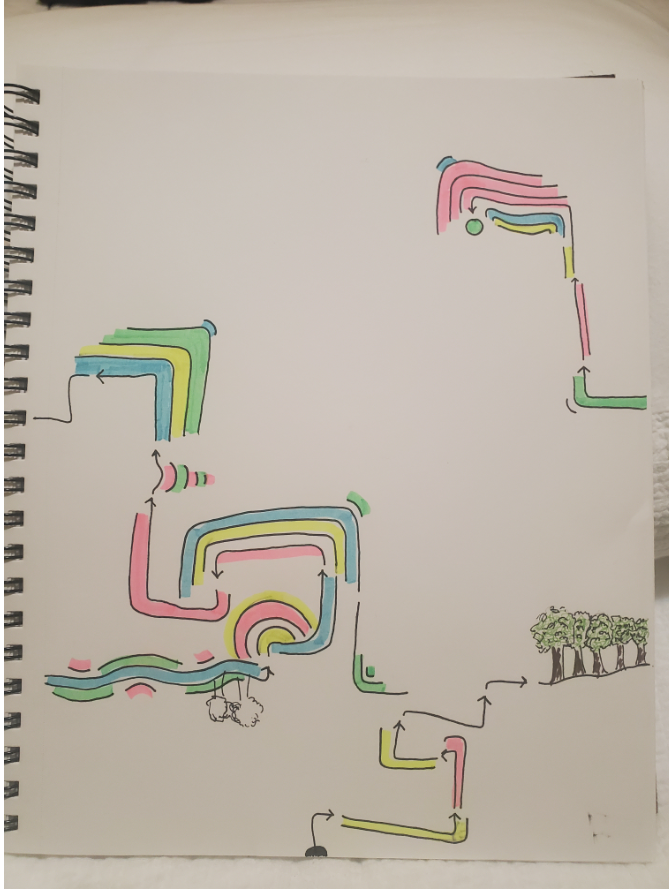
7 – Introducing color 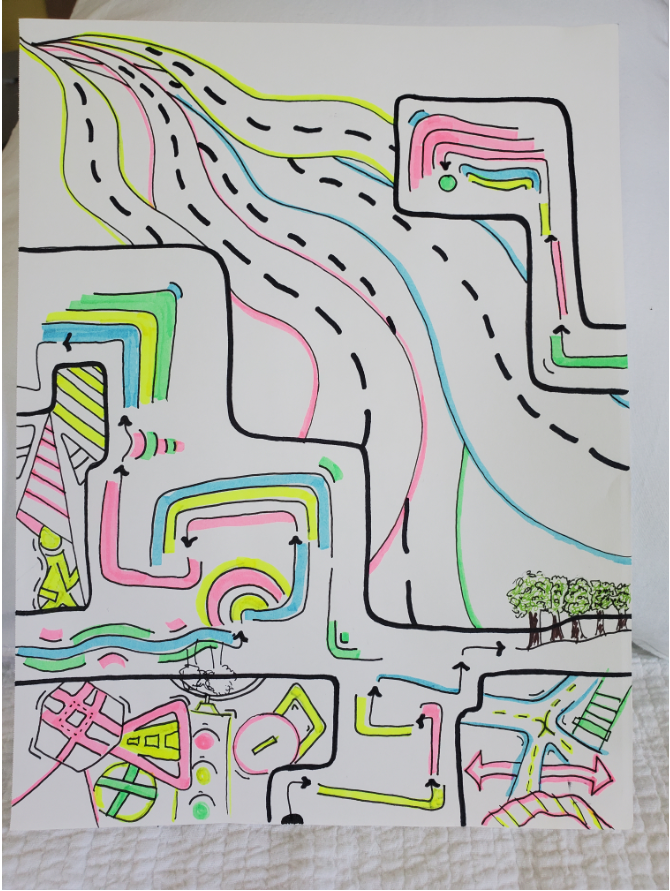
8 – Completed hand drawing drawing 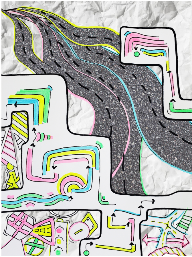
9 – Digitally Enhance Sketch
Of all the Wacky Wednesday creative exercises, Southside Boogie Woogie was the hardest for me. It was so challenging for me to visualize my interaction with south Bethlehem in a way that I felt I had the technical ability to convey. One of the biggest hurdles in my progress was figuring out which medium to complete the assignment in. I really wanted to use Illustrator for the project, but I really only feel comfortable creating clean, geometrical, almost logo-type graphics, and the nature of spatial interpretation lends itself to more abstracted expression, which is easier by hand. The process ended up going like so:
I mapped out the roads that I most commonly run in Bethlehem to see if it creates an interesting shape or pattern. Evidently, it does not. I started thinking about Guy Debord who I learned about in Architecture theory and his “psychogeography” map which I think is a great piece. I experiment with mapping out all of the turns involved in the dreaded “center-main” loop which the team has run ad nauseum since long before my time (its one of those routes that I can picture if I close my eyes, which gave me an idea for later). If you look at image number 3 you’ll see that that also did not create anything very interesting. I had spent a ton of time at this point experimenting and racking my brain on what to do with illustrator and then I got frustrated and just started sketching. I ran through a couple little thumbnails, all of which played on the idea of arrows. Eventually, thinking in the vein of psychogeography, I decided to do a sketch where I closed my eyes and let my hand map out my motion and direction while running a short route through the southside (one which I similarly know like the back of my hand). This rendered image 5, which I really loved. I actually wanted to submit number 5, but in all its brilliant simplicity I felt that it was insufficient for the assignment. I ended up introducing a digital element to the project in the end, by elaborating on my sketch using photoshop to bring it to the level of visual interest that I knew it should be at. On the downside though, it looks like I wasn’t able to make it through the class without using the cliched “crumpled paper” texture. Oh well, it’s popular for a reason.