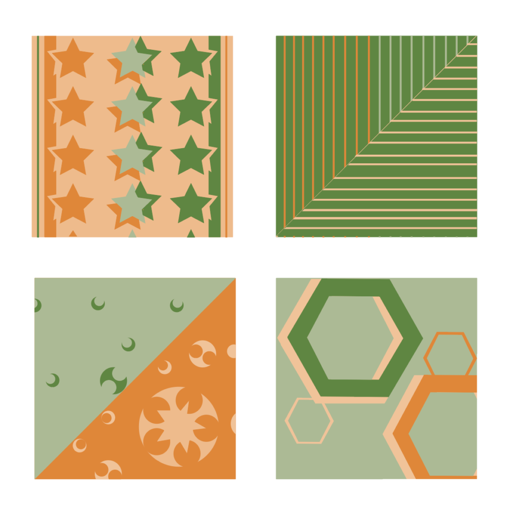
One thing that I’m not sold on for these pieces is how you use the edge. In the top right, the stars continue on the bottom, but not the top. You also only have small slivers at the bottom right of the hexagon piece which is a little cramped to me. I might tighten up the consistency of the lines on the top right too.


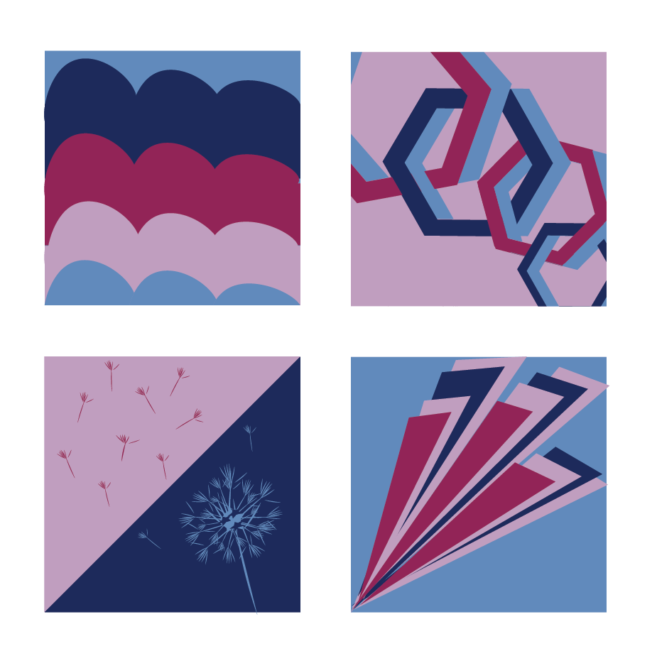
Perhaps try some alternate color palettes with a bit more contrast and consistency in saturation levels. The designs could be more dynamic as well.
One thing that I’m not sold on for these pieces is how you use the edge. In the top right, the stars continue on the bottom, but not the top. You also only have small slivers at the bottom right of the hexagon piece which is a little cramped to me. I might tighten up the consistency of the lines on the top right too.