
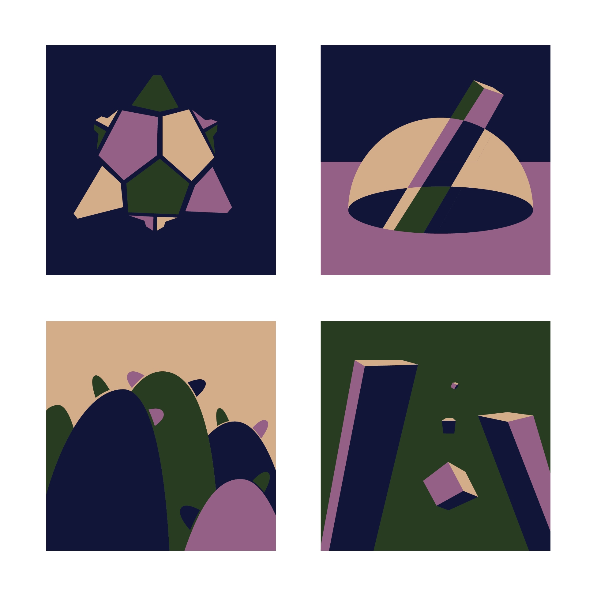
I am satisfied with the top left and bottom right, though I am not sure what to do with the other two. I am planning on completely redoing those two, but all suggestions are welcome! (also illustrator chopped off the frame of the pic when saving, but I’ll also fix that later).
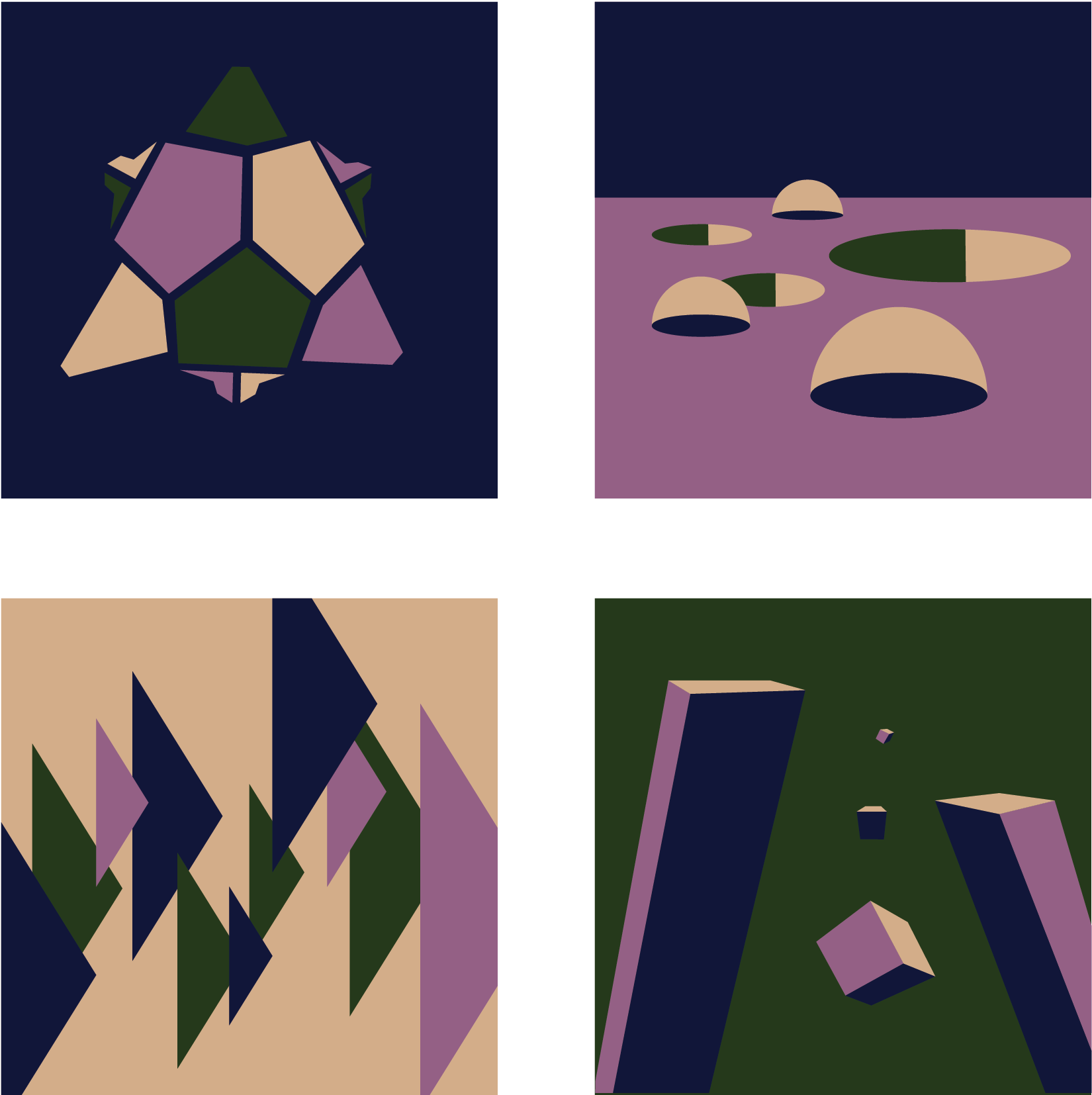
Here is an updated picture. I am still not happy with the other two, but we are getting somewhere! I decided to stick with the same colors because I couldn’t find any others that I felt went as well together.
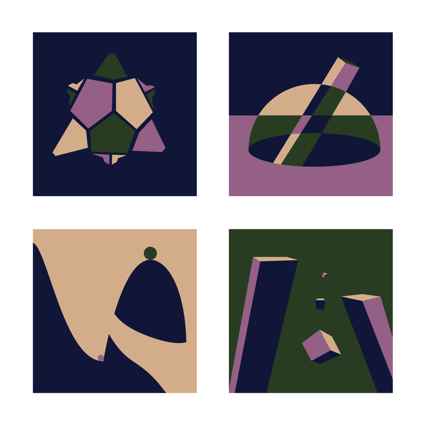
Another one!

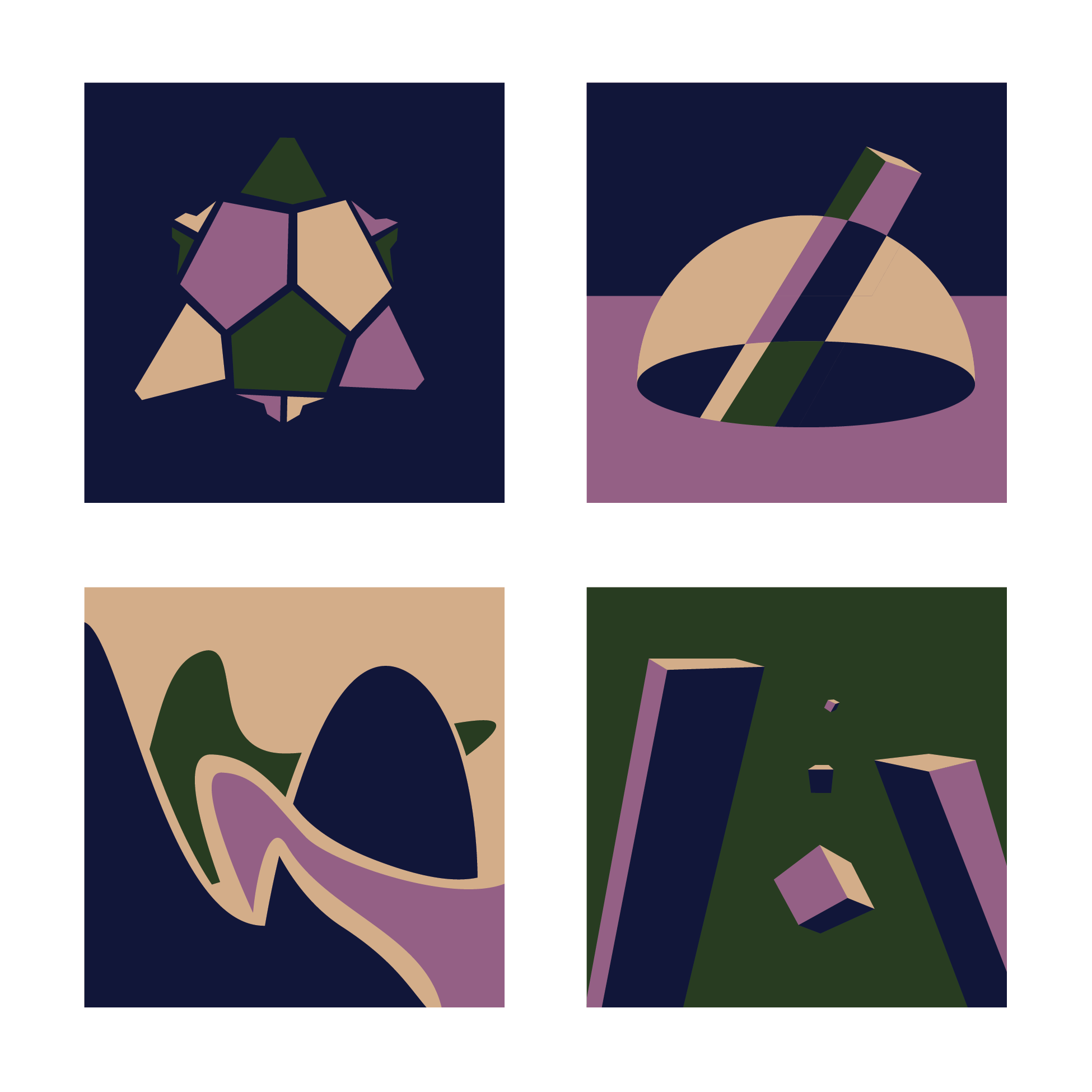
Final
I agree with your assessment. Both of those pieces have a strong sense of form, though the lower right features a a better composition. I’m not feeling that mossy green. Maybe stick with a cooler color with similar value. An analogous approach to the colors would be a safe bet. You could also try a pale yellow to replace the light earth tone. Easy enough to swap colors with designs so throw a few alternates out there.