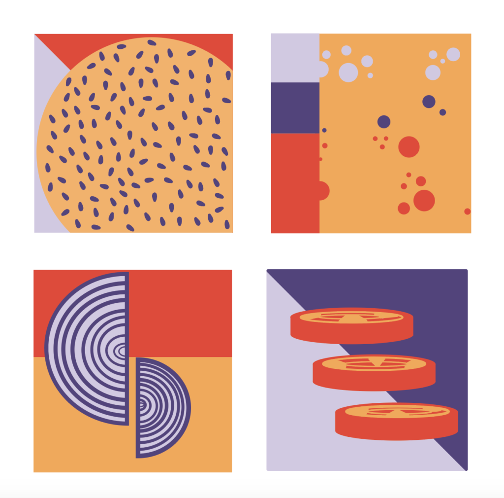
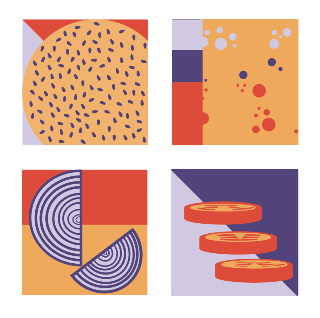
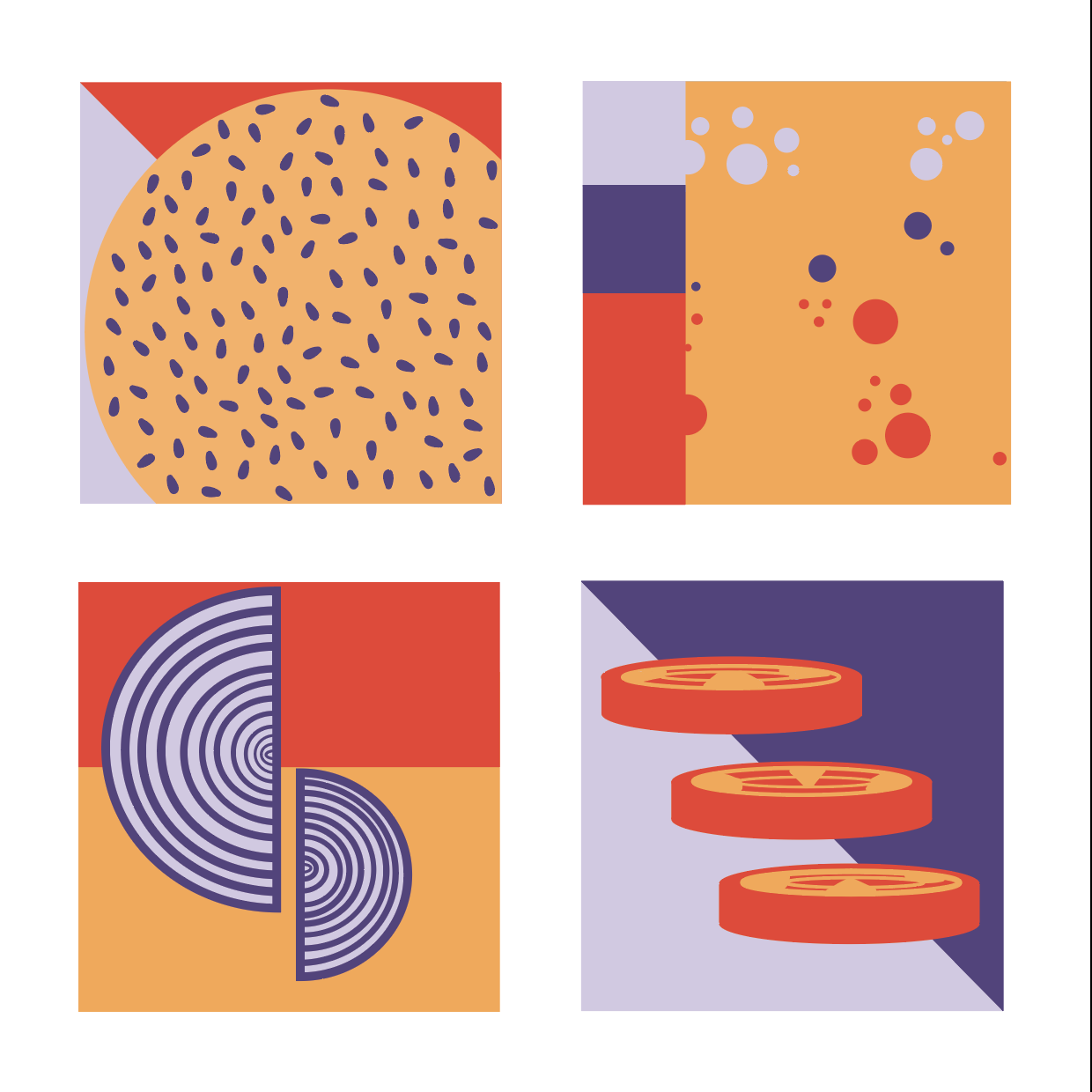
I do like the conceptual approach to these and the “fast-food” palette, but I think the compositional arrangement could be stronger in some of the designs (particularly the lower left and upper right). In an earlier variation you played with a tighter croppings of the objects which was a bit claustrophobic. I think thee would be best served as more graphically composed icons. (And please put all of the alternate version in one single gallery so we can see them all during crit)
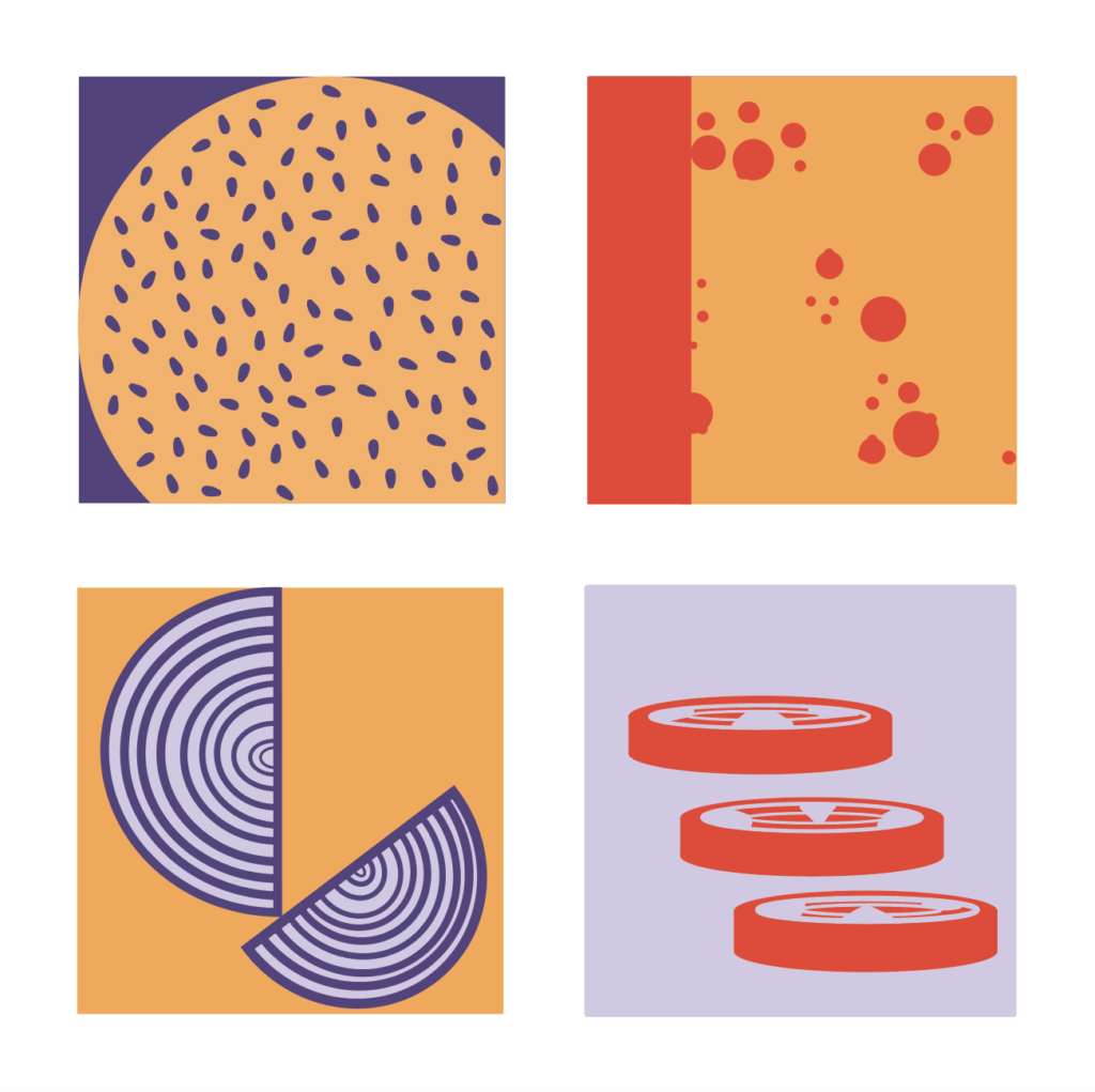
I think that the onion one definitely looks better than the original. the point/balancing act defiantly had unwanted tension in the piece. I still don’t know if it is resolved yet. what your crops again with closeness, the right onion is uncomfortably close to the center line. what if the centers fo the onions where aligned? I really like the changes in line thickness, but they are very subtle.
for the top right, I think where it misses the mark, when you consider all 4 designs, is the simplicity of the shapes created. in all the others you have large shapes that are diagonals and circles of some kind. this one (except the wholes in the cheese which are small shapes) is really just rectangles. also, maybe just me, but it took me a second to figure out it was Swiss cheese but the others I clearly got right away with the context of set of 4.


I do like the conceptual approach to these and the “fast-food” palette, but I think the compositional arrangement could be stronger in some of the designs (particularly the lower left and upper right). In an earlier variation you played with a tighter croppings of the objects which was a bit claustrophobic. I think thee would be best served as more graphically composed icons. (And please put all of the alternate version in one single gallery so we can see them all during crit)
I think that the onion one definitely looks better than the original. the point/balancing act defiantly had unwanted tension in the piece. I still don’t know if it is resolved yet. what your crops again with closeness, the right onion is uncomfortably close to the center line. what if the centers fo the onions where aligned? I really like the changes in line thickness, but they are very subtle.
for the top right, I think where it misses the mark, when you consider all 4 designs, is the simplicity of the shapes created. in all the others you have large shapes that are diagonals and circles of some kind. this one (except the wholes in the cheese which are small shapes) is really just rectangles. also, maybe just me, but it took me a second to figure out it was Swiss cheese but the others I clearly got right away with the context of set of 4.