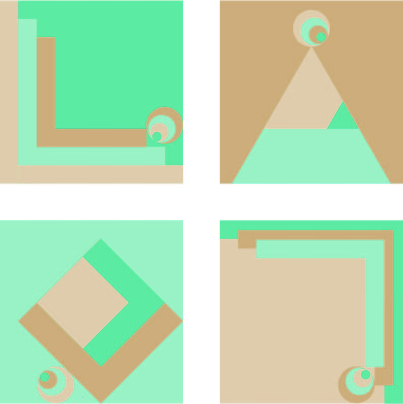
The high saturation turquoise is a bit off-key and overall some more contrast in the palette might help.
I like the design concepts of the simple geometry and tension. It might be worth exploring some southwest-style textile patterns for possible alternate color choices.
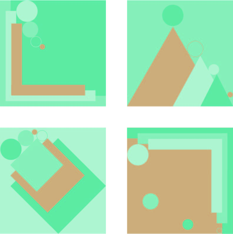
something with the color is missing I think. I like the load blue and the two browns together. I would play around with the grayish purple/brown you choose to bring it together more. I think something closer to the vibrance of the blue that the subtle tans. how would a lavender feel? what about a red or light pink?
The narrative is coming along nicely in these. I like the rotating “eye” as a central character. The palette is still creating a lot of optical activity that makes them hard to focus on. Keep trying different color combos.

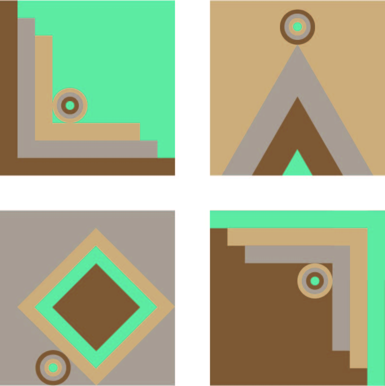
The high saturation turquoise is a bit off-key and overall some more contrast in the palette might help.
I like the design concepts of the simple geometry and tension. It might be worth exploring some southwest-style textile patterns for possible alternate color choices.
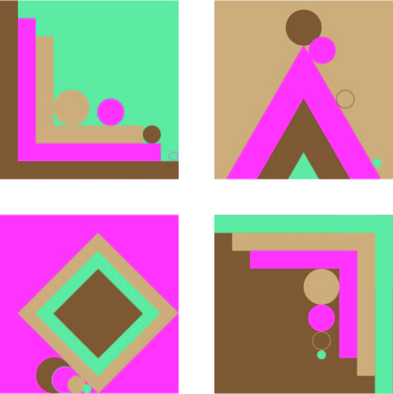
something with the color is missing I think. I like the load blue and the two browns together. I would play around with the grayish purple/brown you choose to bring it together more. I think something closer to the vibrance of the blue that the subtle tans. how would a lavender feel? what about a red or light pink?
The narrative is coming along nicely in these. I like the rotating “eye” as a central character. The palette is still creating a lot of optical activity that makes them hard to focus on. Keep trying different color combos.