Effective use of the gradient and a wonderful sense of light. The compositional use of the “O” creates a compelling perspective and keeps it from being a simple landscape illustration. (I’m assuming everything in here is modified typography.) Log in to Reply

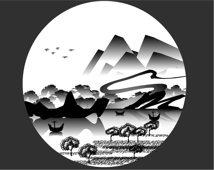
Effective use of the gradient and a wonderful sense of light. The compositional use of the “O” creates a compelling perspective and keeps it from being a simple landscape illustration. (I’m assuming everything in here is modified typography.)