Nice work. These all have interesting potential. The large black letter design has some nice interactions but a few spots that need more refinement.
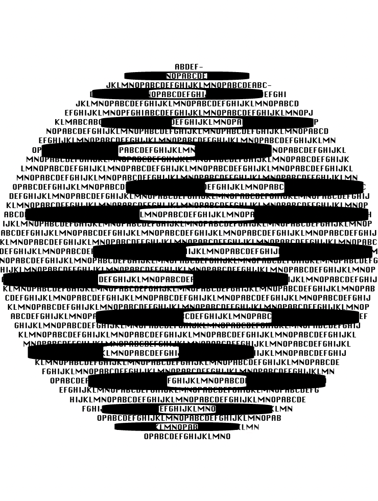
The design you selected for the featured image is most concise. I like that the obscuring Os feel like redactions and the left/right shifts on the placement work well. It looks like your missing some letters (A-Z must all be used) and I please remove the hyphens.
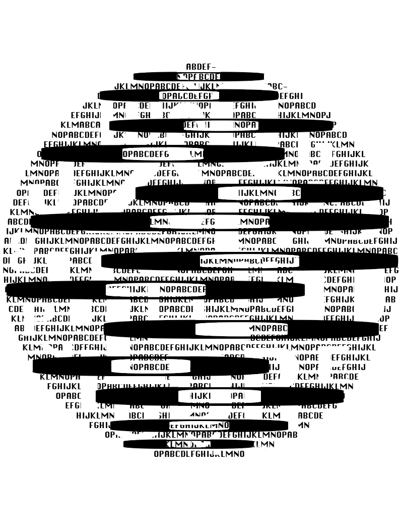
The second variation is also interesting with the subtractive gaps. Reminds me of the stock listings in print.
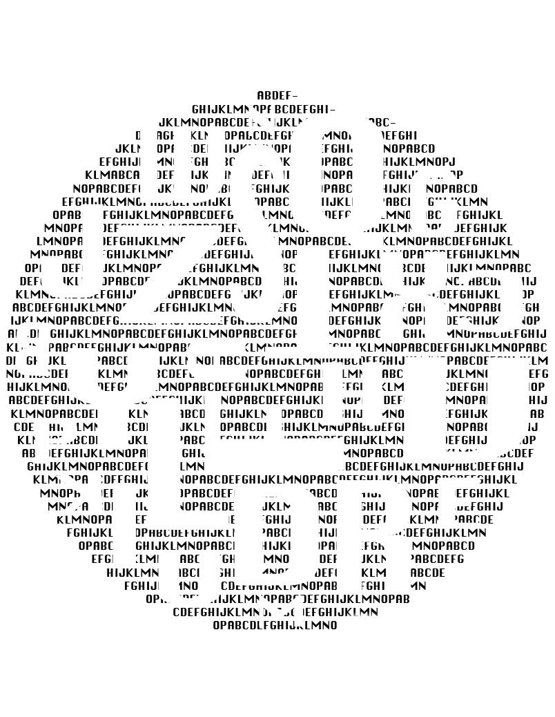
The final subtractive option is also good, but I might like to see some of the white letters bleed into the circle edge.

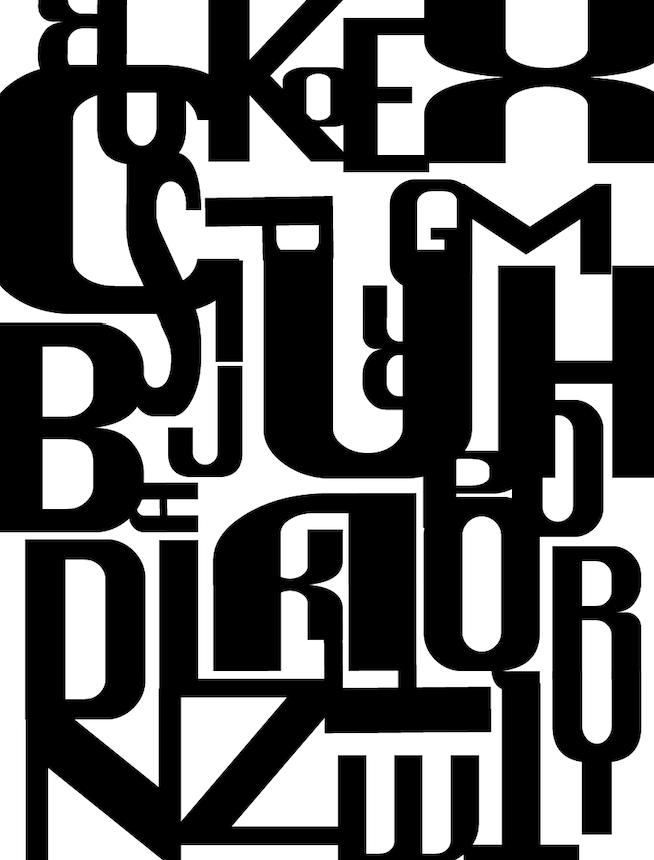
Nice work. These all have interesting potential. The large black letter design has some nice interactions but a few spots that need more refinement.
The design you selected for the featured image is most concise. I like that the obscuring Os feel like redactions and the left/right shifts on the placement work well. It looks like your missing some letters (A-Z must all be used) and I please remove the hyphens.
The second variation is also interesting with the subtractive gaps. Reminds me of the stock listings in print.
The final subtractive option is also good, but I might like to see some of the white letters bleed into the circle edge.