
I plan on doing a few other ideas as I get a better handle on Illustrator, but here are the ones I’ve made so far!
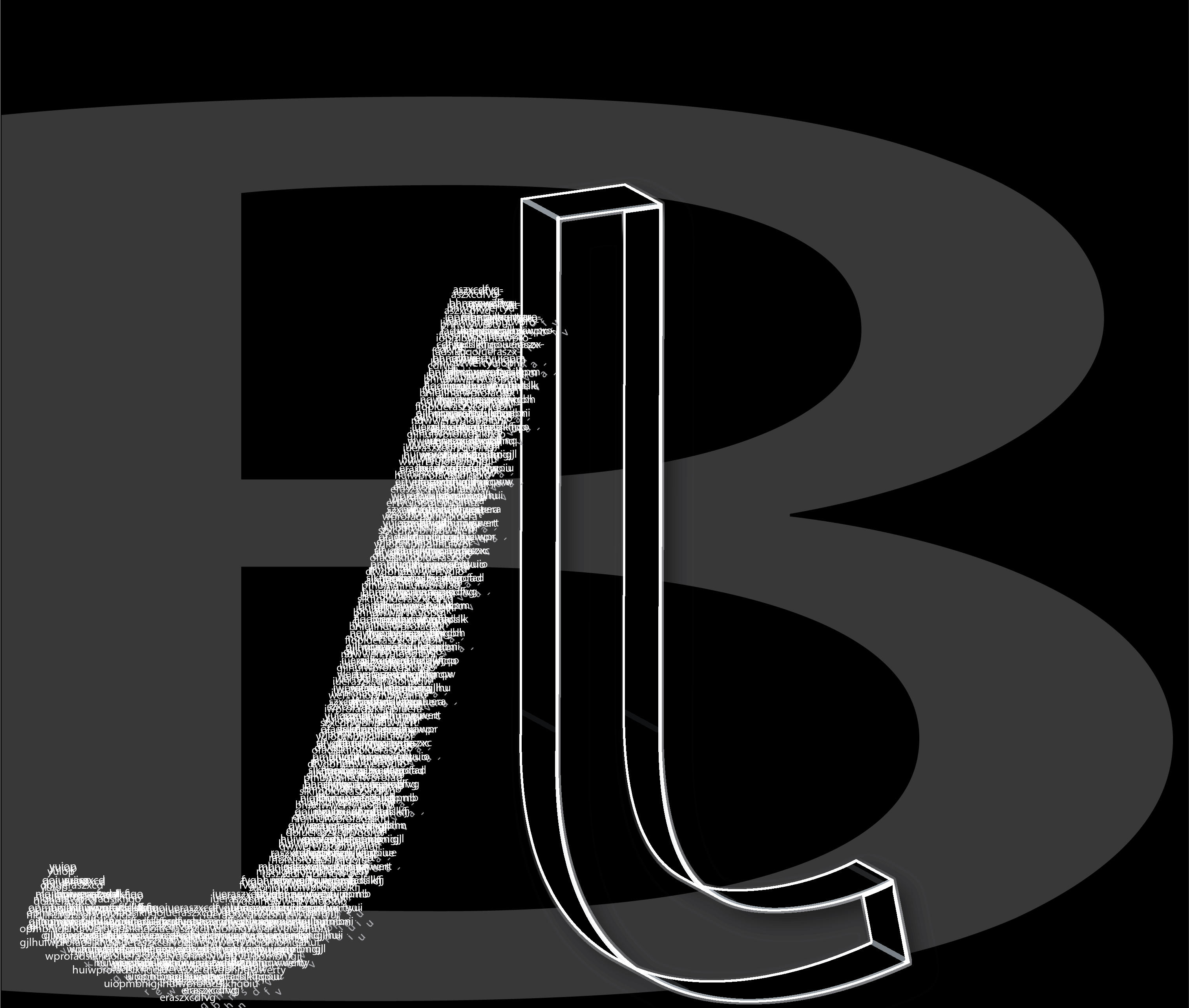
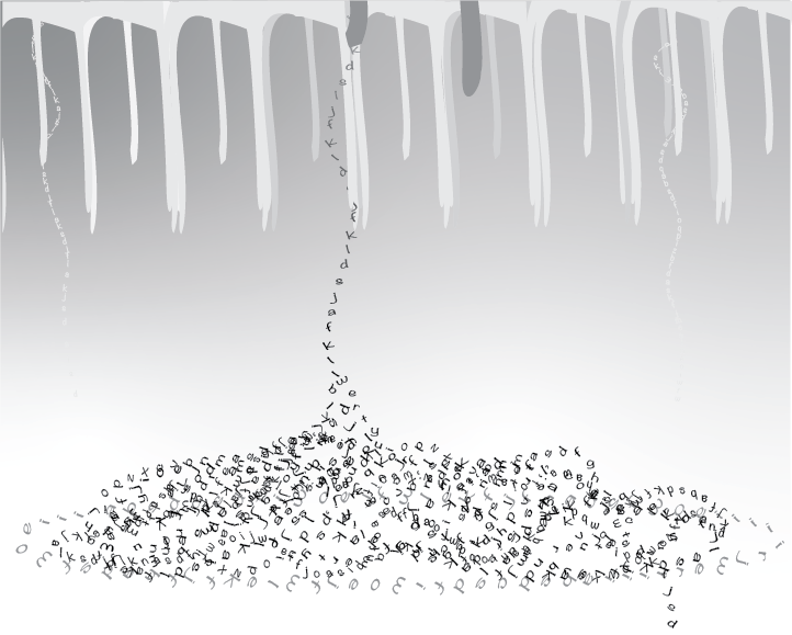
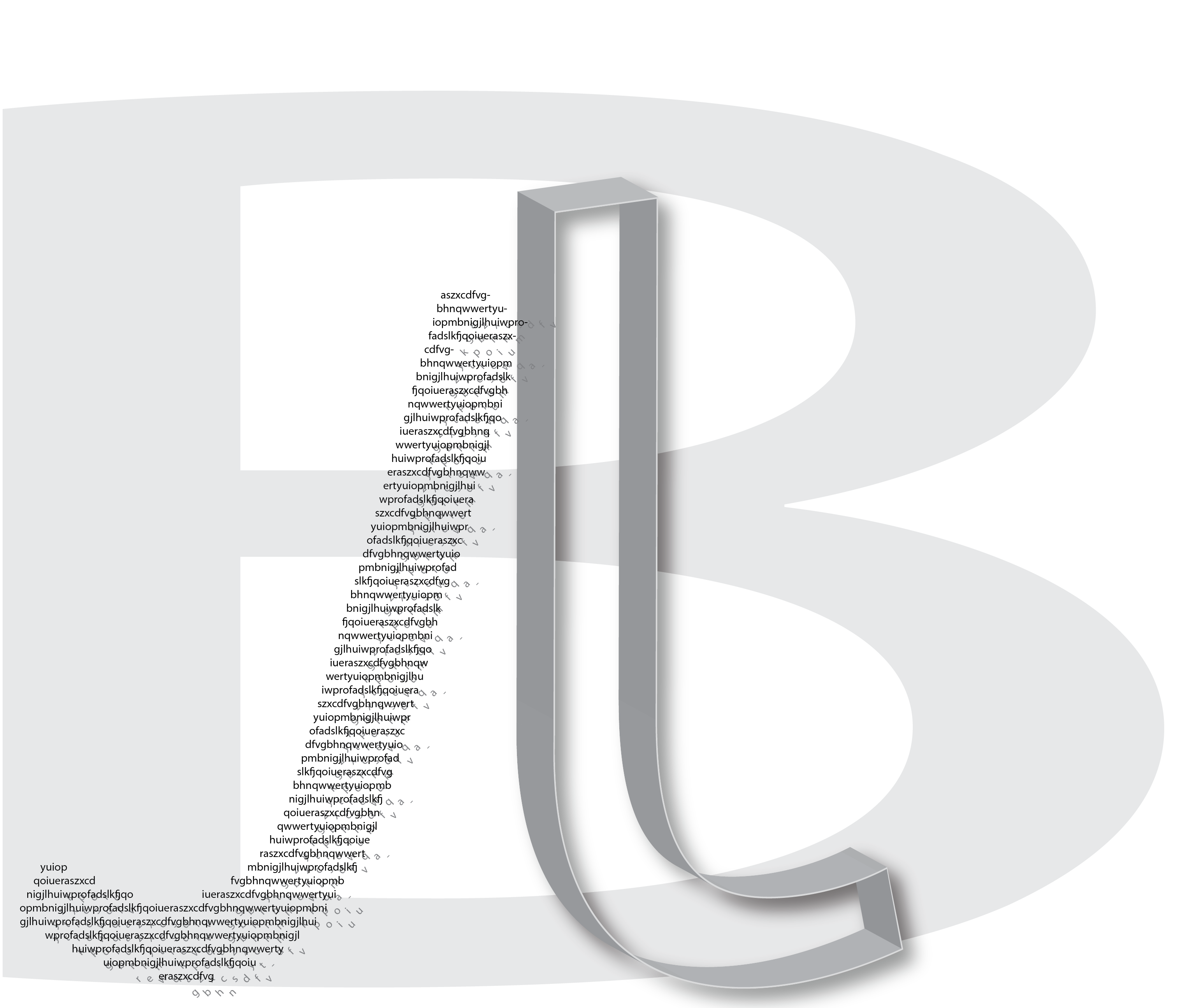
First one – drippy letters. Pile them up. Second and third – my initials! The black actually came after the white, and I like it a lot better.
Some nice graphic play in the initial pieces, but the alternate styles have a bit too much variety to work together in one composition.
I also like the organic quality of your “pile.” But again there might be a more consistent treatment you can find for the top of the composition that integrates better graphically.
Thank you for your feedback! Is there anything you might recommend doing to help the compositions?
I like the interaction the two J’s you made have with each other. There’s a nice contrast in their visual style, especially with them leaning on each other. The B in the background is pretty out of place to me since the J’s each have such intrigue.
Thank you for your feedback! I worried that the background seemed a bit too empty, but taking out the B might help direct the focus to the Js. What would you recommend?
I still think the pile is better compositionally. The initial piece has three individually compelling elements(one textural; one planar and one graphic) that don’t really work together.