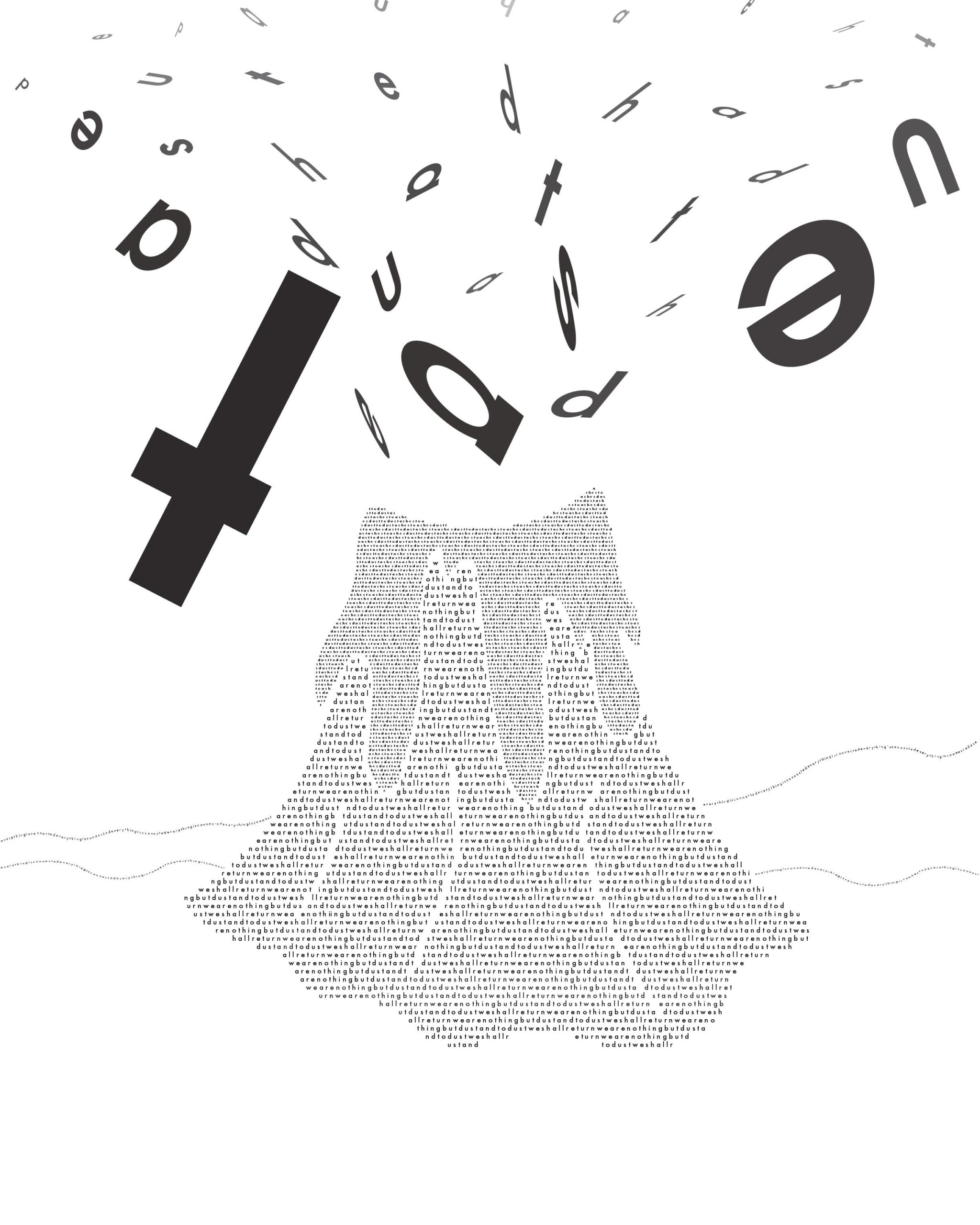
Nicely executed. My only suggestion would be to try a variation where the spewing letters use gray values instead of black. The value of the volcano is a little more delicate with the fill type. You could also try converting the black letters to path or fill type to follow suit.
I really like how you have created the sense of 3d space with the placement and manipulation of the “air borne” letters. rotating them so that they seem to exist rotated to the xy plane of the page it awesome.
the only thing thats bothering me is the top row of letters being the only letters in the air that are aligned in a row mostly. I would try to break that up a little more. that probably happened because you had to make a design choice of what to do with the border and if you wanted to cut any letter off. if breaking them up from that horizontal alignment means they will be cut off by the border, I would just try to make it happen a couple times. Don’t just place only one letter high enough to get cut off at the border.