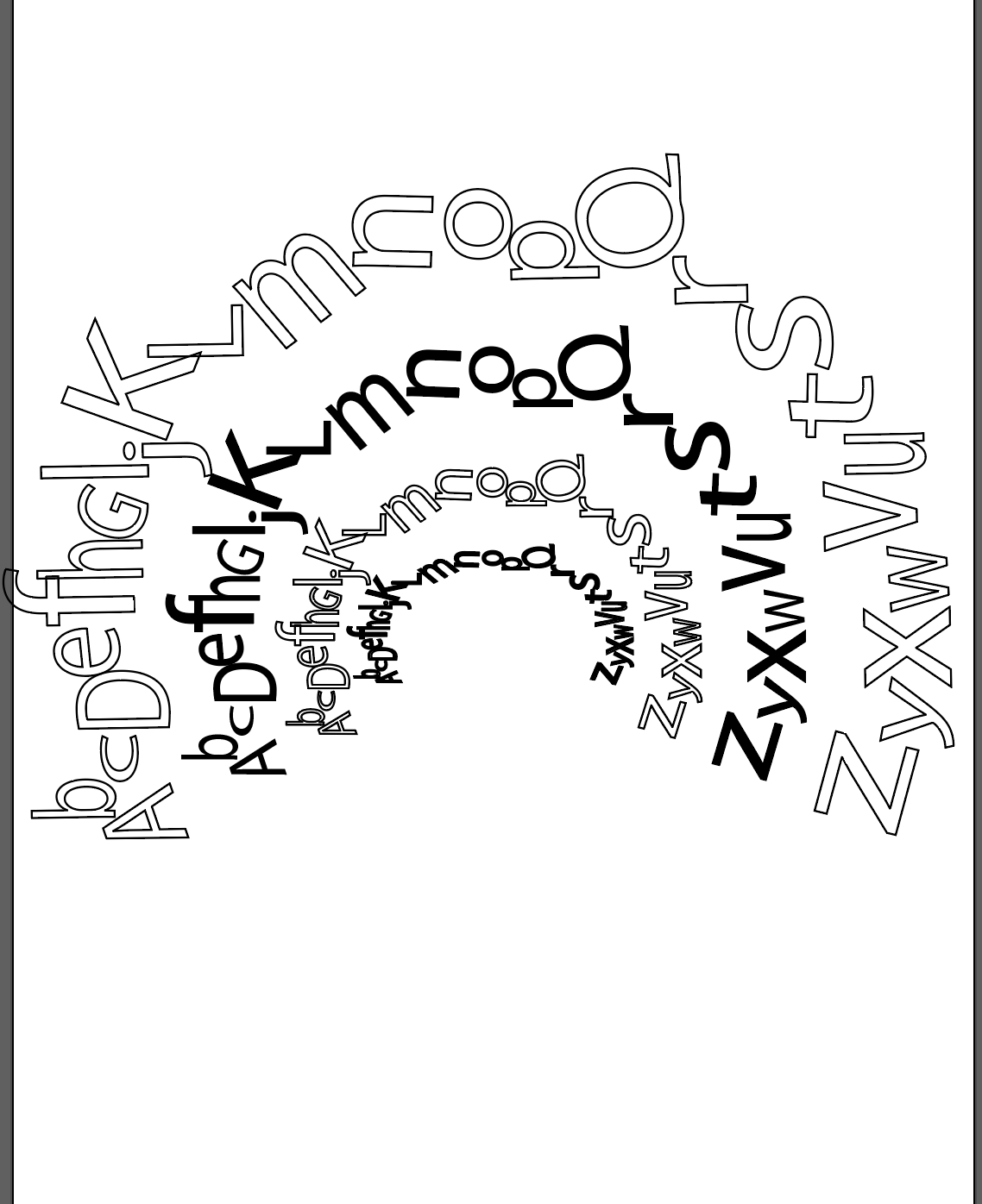
I think that the second design is the strongest. I would keep playing with resolving the open space in the middle. the design going further over to the left versus the first version definitely fixes the issue of being heavily weighted on the right side.
I would play around with have more dramatic size differentiation to draw more interest into the piece. I think the very bold Z on the bottom of the last one was a strong element, almost acting as a support / grounding element.