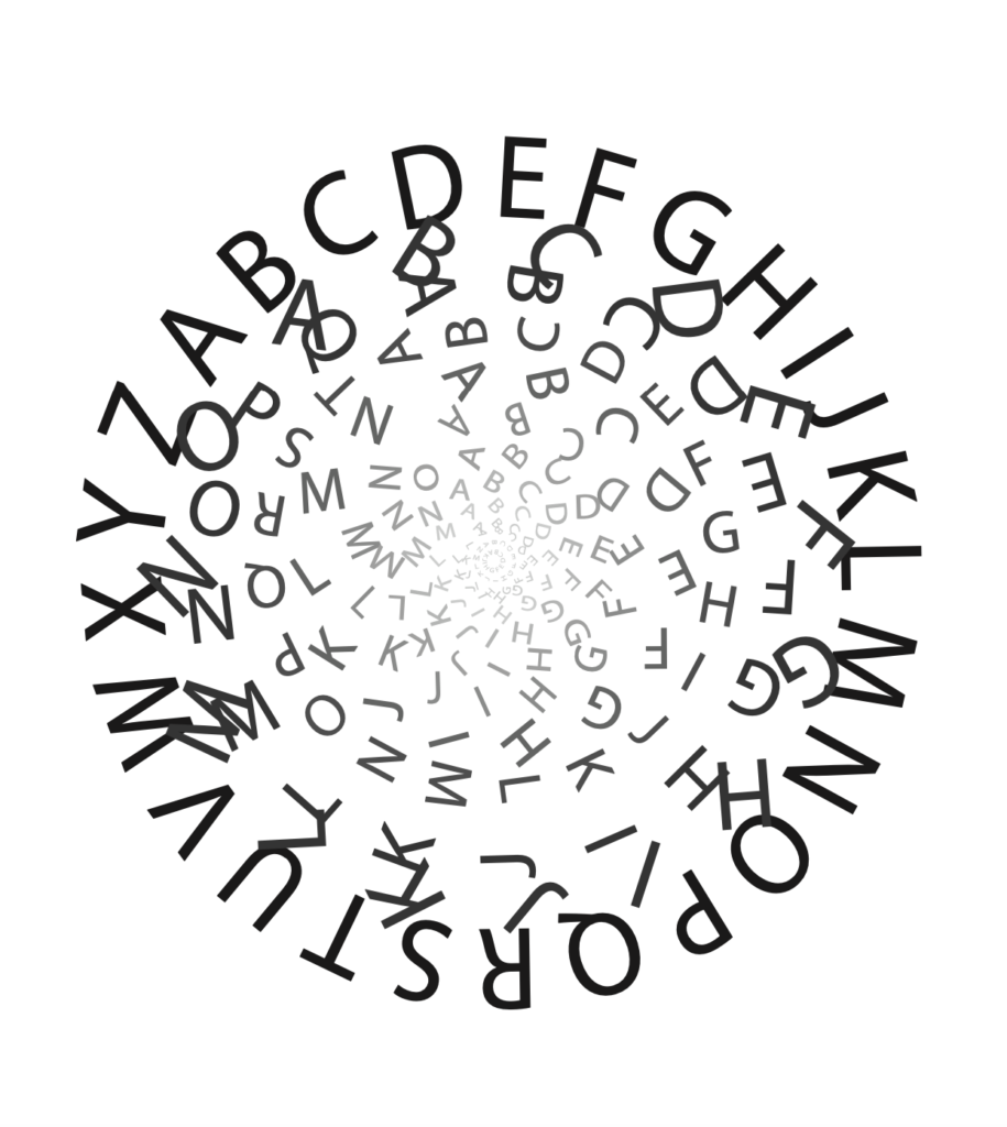
I like this concept and the scale and placement. There are a few overlapping letters in the second ring that could be refined at bit more.
Overall you seem to play with letters “not quite touching” so maybe try a variation that deletes that second ring entirely.
I think deleting just that second ring would solve that issue too. it is the only break in the pattern really. no further change but taking it out really because the colors and spacing look like they would still flow cohesively
I like that the letters start to rotate as we process further in to the center of the concentric circles. the two smallest circles break this pattern. I’m curious how they would loo also rotated like the other. like the outside circles is aligned and as you progress inward, the letters get progressively rotated/jumbled?