Both of these designs are really striking. I really love the way that you’ve created space both with atmospheric perspective and vanishing points. They both have cool ambiguity of space, but the one with the N does this really well. Each part of the piece is digestible on its own and you can understand where it came from with the letters, and they all work together really well when put together.

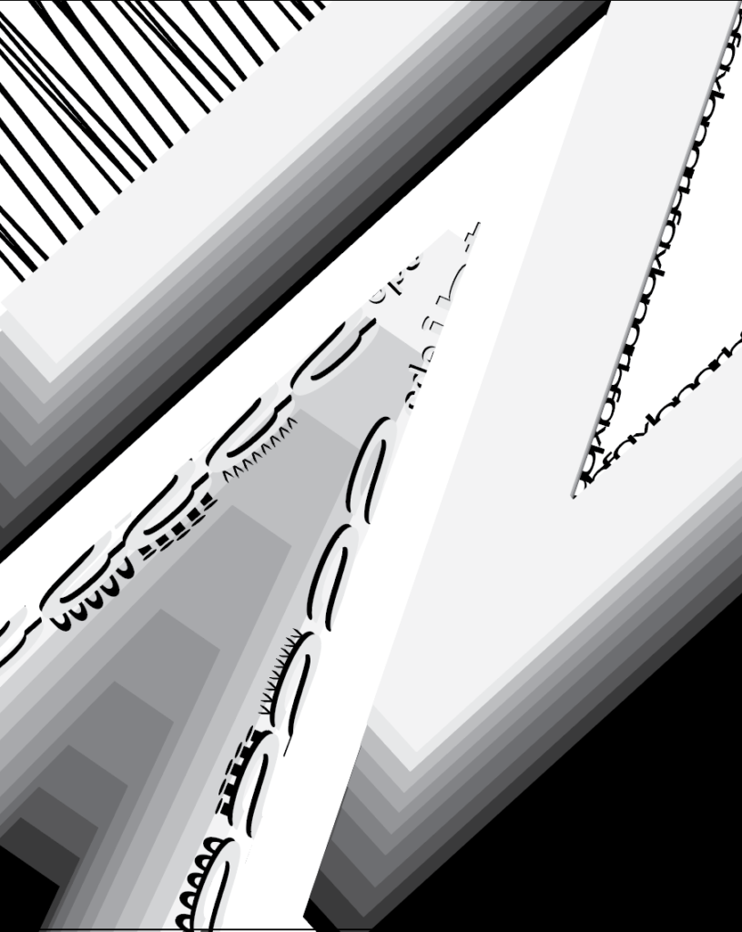
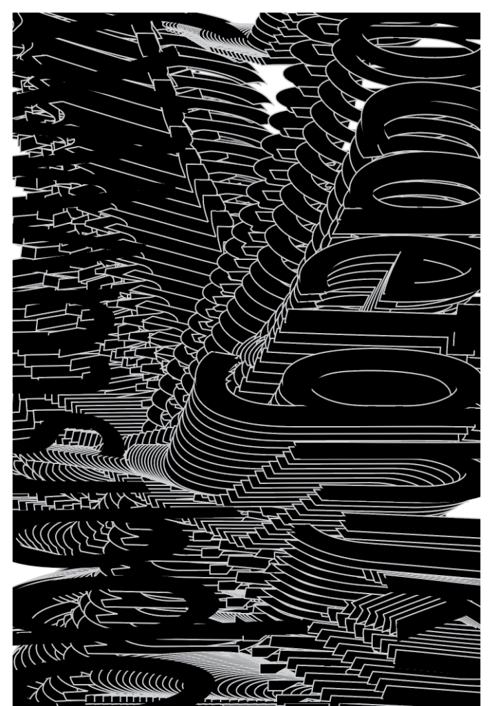
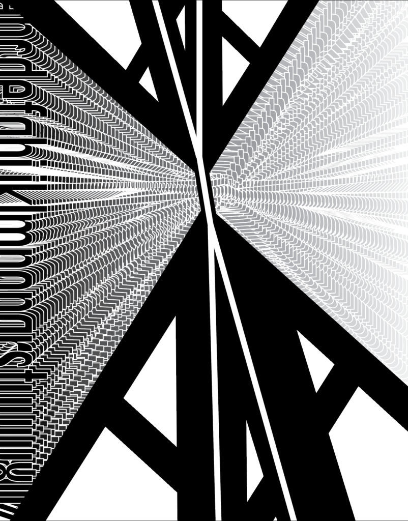
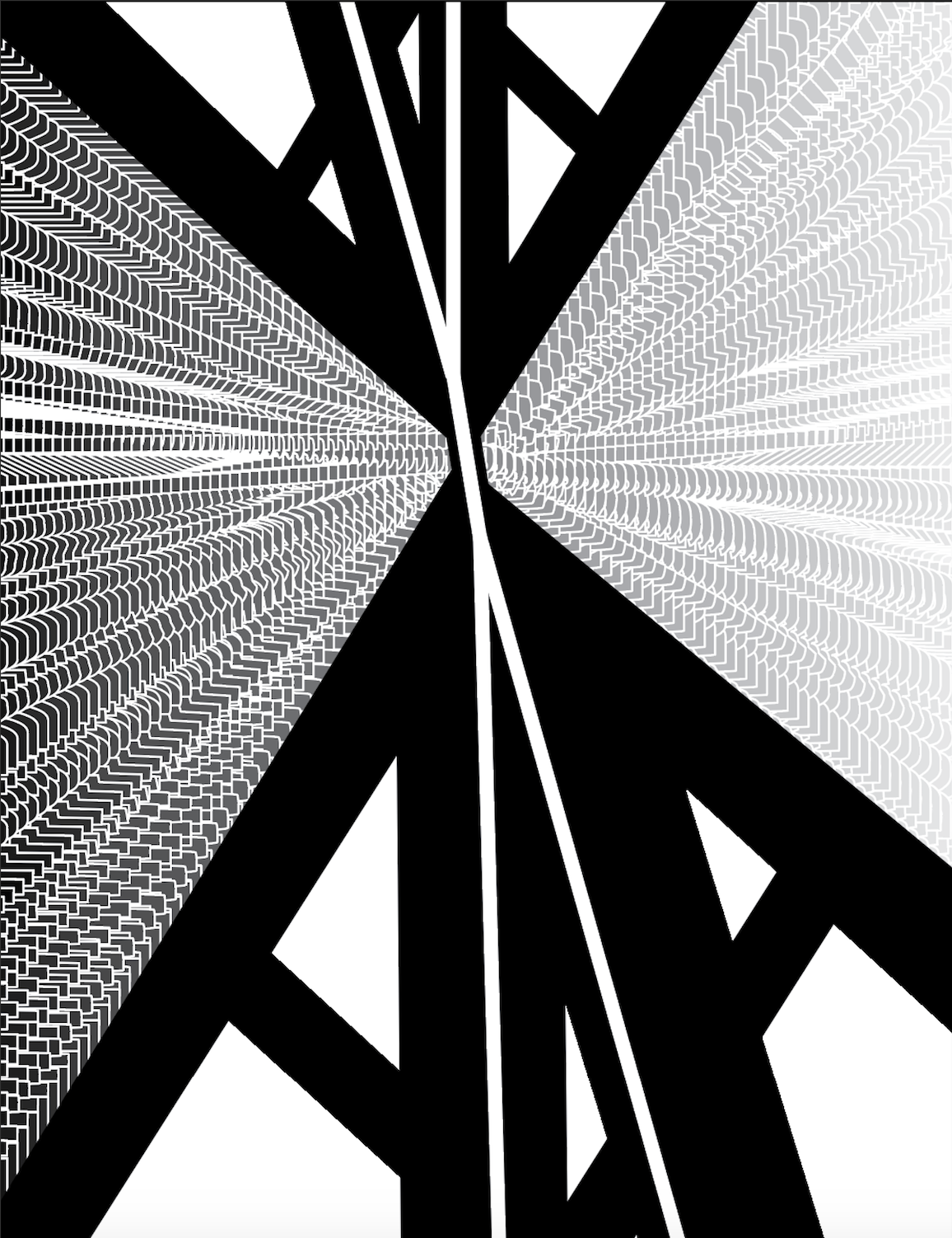
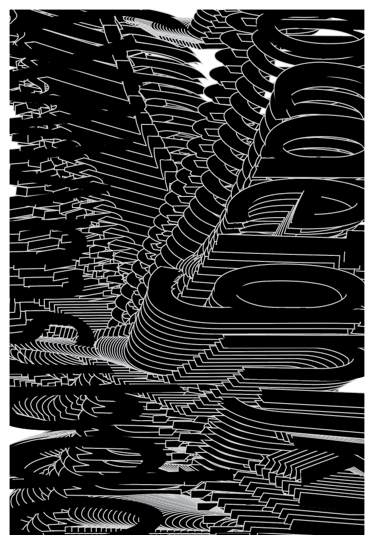
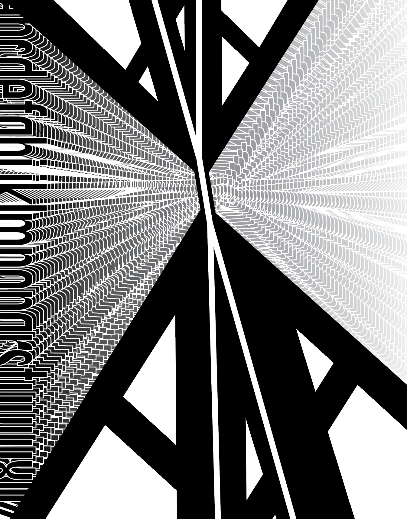
Both of these designs are really striking. I really love the way that you’ve created space both with atmospheric perspective and vanishing points. They both have cool ambiguity of space, but the one with the N does this really well. Each part of the piece is digestible on its own and you can understand where it came from with the letters, and they all work together really well when put together.