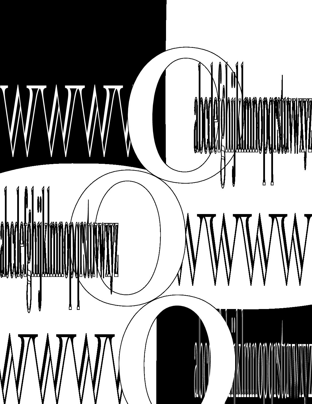
This is a good start, Brooke. The alternation of the Os starts to develop an interesting narrative and the pointy Ws fuse nicely together to create some graphic tension.
The lower case letters don’t work as well, so perhaps try using upper case letters that share consistent margins on top and bottom.
I like the push and pull that’s going on with the lines of letters and the O’s. The black areas on the top and bottom kind of confuse me with that central cut-off; it’s cool how they are lined up with the rows of letters, but the cut-off place inside the O’s seems less motivated.