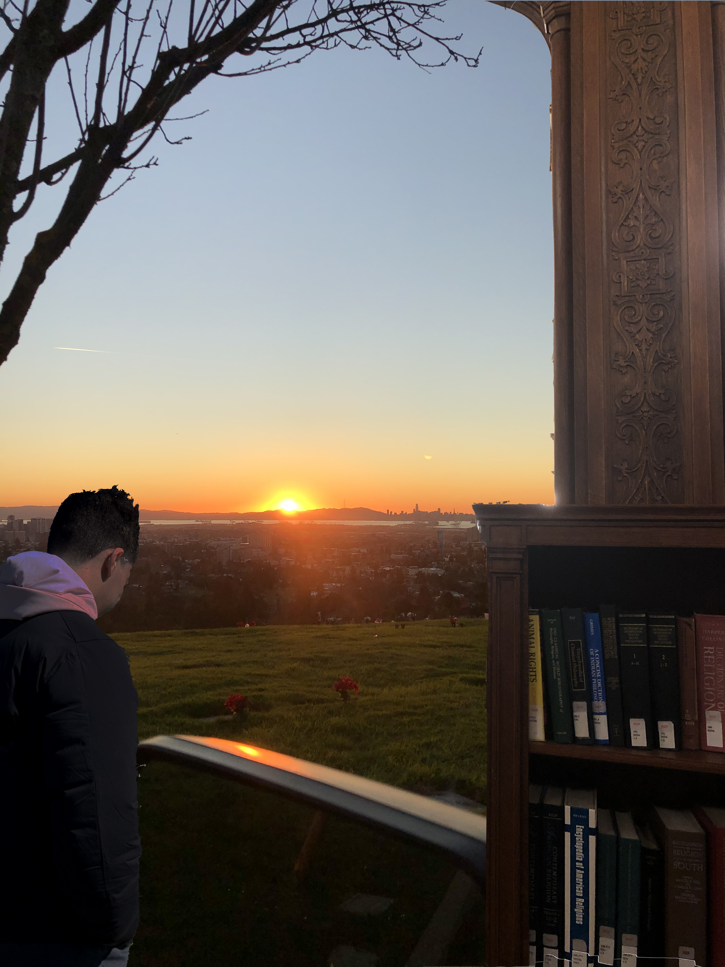
try to play with the adjustments layer that apply only to one layer. I think that it would really improve the photo if the lighting/tones of the separate images felt more like the same photo. right the book case is clearly inside lighting not sunset lighting. if you use the function where you apply an adjustment layer that only applied to the layer direct below it, you’ll be able to match the lights better. you could also go the other way with this function if your goal was to have them look different. with the goal of tying things together more, that is my suggestion.

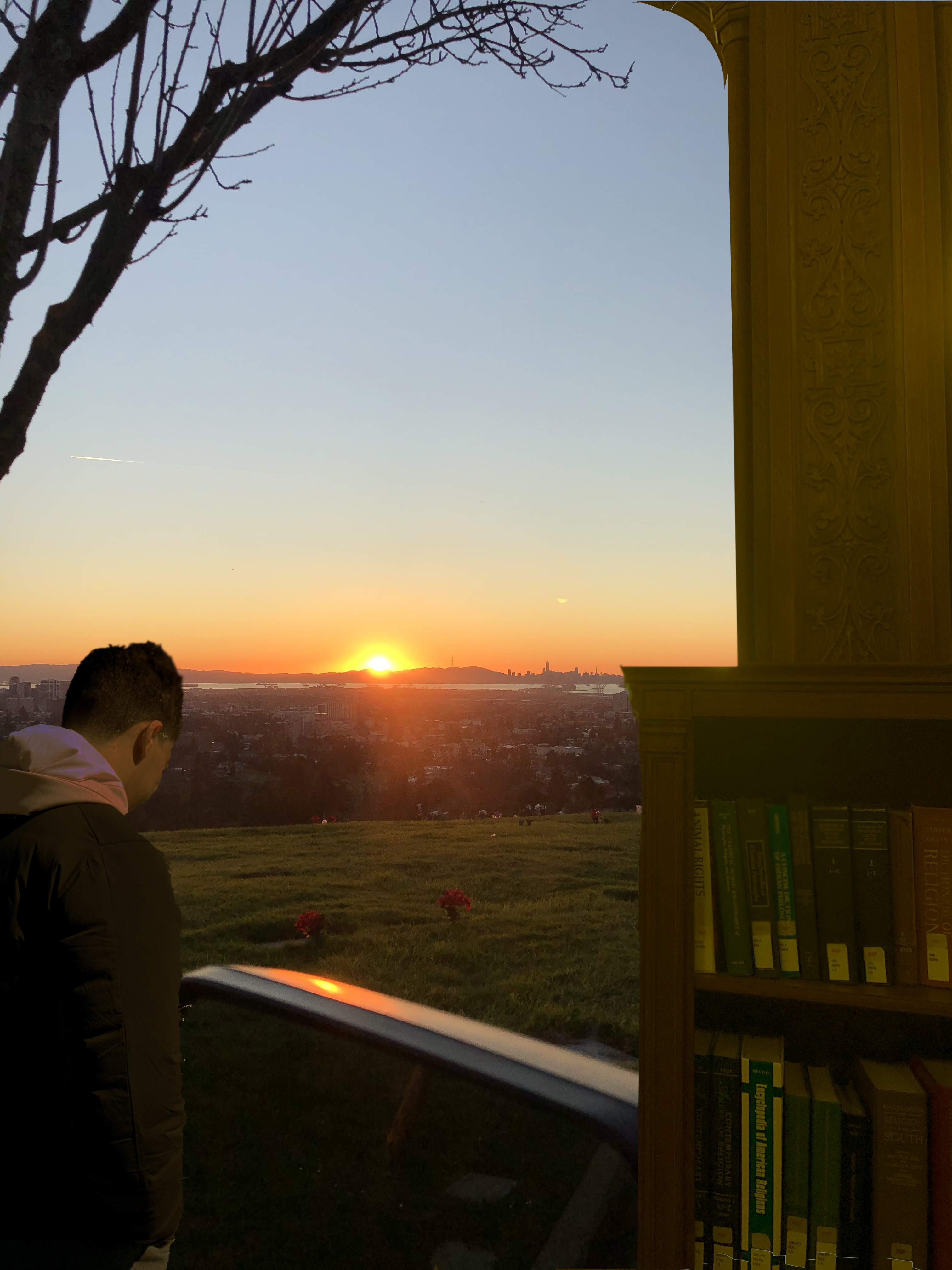
Good concept and composition, but try some variations of graphic treatments to explore options for color and value. Needs some contrast.
try to play with the adjustments layer that apply only to one layer. I think that it would really improve the photo if the lighting/tones of the separate images felt more like the same photo. right the book case is clearly inside lighting not sunset lighting. if you use the function where you apply an adjustment layer that only applied to the layer direct below it, you’ll be able to match the lights better. you could also go the other way with this function if your goal was to have them look different. with the goal of tying things together more, that is my suggestion.