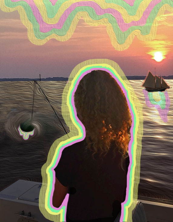
I need to work on the shadow of the boat but am not sure how to do that… I also can’t decide if I hate this or not. Please let me know your thoughts!
2 thoughts on “Self Portrait Progress 2”
Graphically it’s all over the place with the integration of so many disparate elements.
I might suggest starting with a new image that will provide you with a better opportunity to create stronger contrast and graphic consistency.
If you stick with this image, follow the leads I provided with the sample images I sent for reference.
how did you choose the color scheme of the drips? I think they work together, but they don’t work with the boat/figure image. the composition is very overwhelming right now. if you stick with it, I would work on the colors just being of entirely different feels. the bottom of the image that has the boat doesn’t really offer a lot to the image, could you photoshop or crop that out?