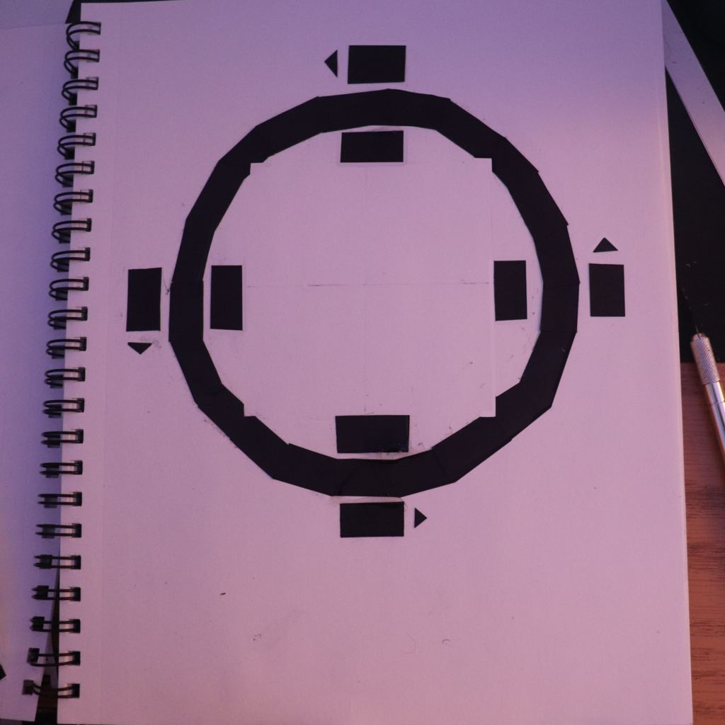
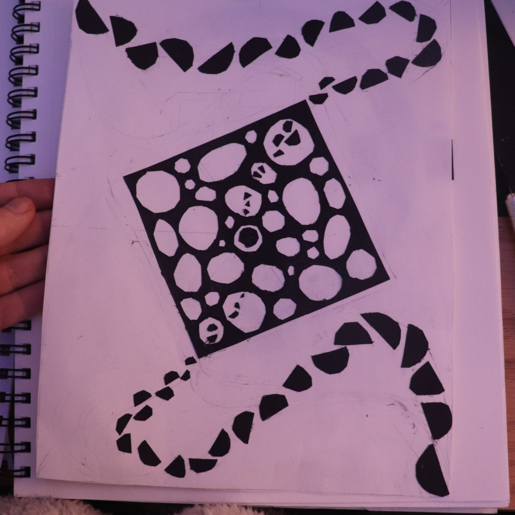
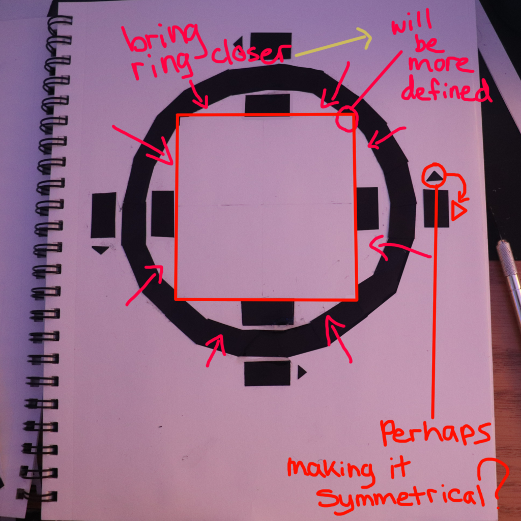
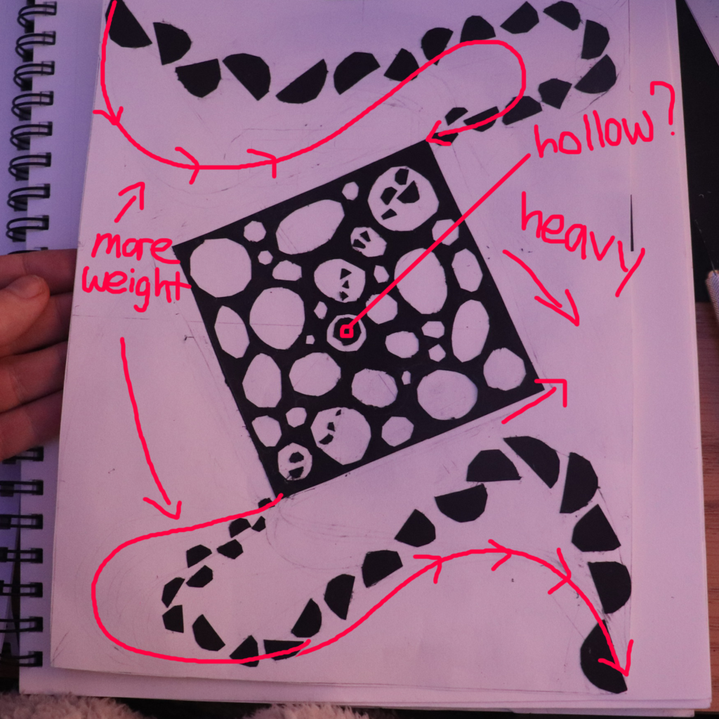
This project is mind-boggling, but this is what I’ve come up with. These 2 are the “Manipulate the Square: Having the Square Shown” The symmetry is off, I am working on that. Any advice? 🙂

I edited this one in photoshop to clean up the lines a bit, working on the logistics of construction, but it’s possible. 
The first one that I made, just thought I’d go with the flow?

If I reduce the radius, the corners will be larger, but I have room because the triangles in juxtapose to the rectangles on the outer circumference will fit just perfectly I feel. 
Or I could just make the square centered and not have to worry about weight.


I prefer the symmetrical design. The minimal presence of the notches that create the implied central square are subtle and unique. I also like that the circular element is actually formed formed from joined straight lines. The directional arrows on the exterior also create an interesting counter-clockwise rotation that keeps things from getting static.
The second design has potential, but lacks the spatial intrigue that was present in your line project designs. Also not as compositionally dynamic with the figure/ground relationships.