I love the addition of the very skinny lines in the diagonal line design that we discussed. It now reads as a much more dynamic and full pieces, as before it plain. I’m not sure how I feel about the first line in the right triangle being a different thickness that wraps around the corner. I think it reads very nicely in the left triangle when the outside lies are the same thickness. The playing with inverting the black and white when crossing domains in the H/V is new! I like that addition.
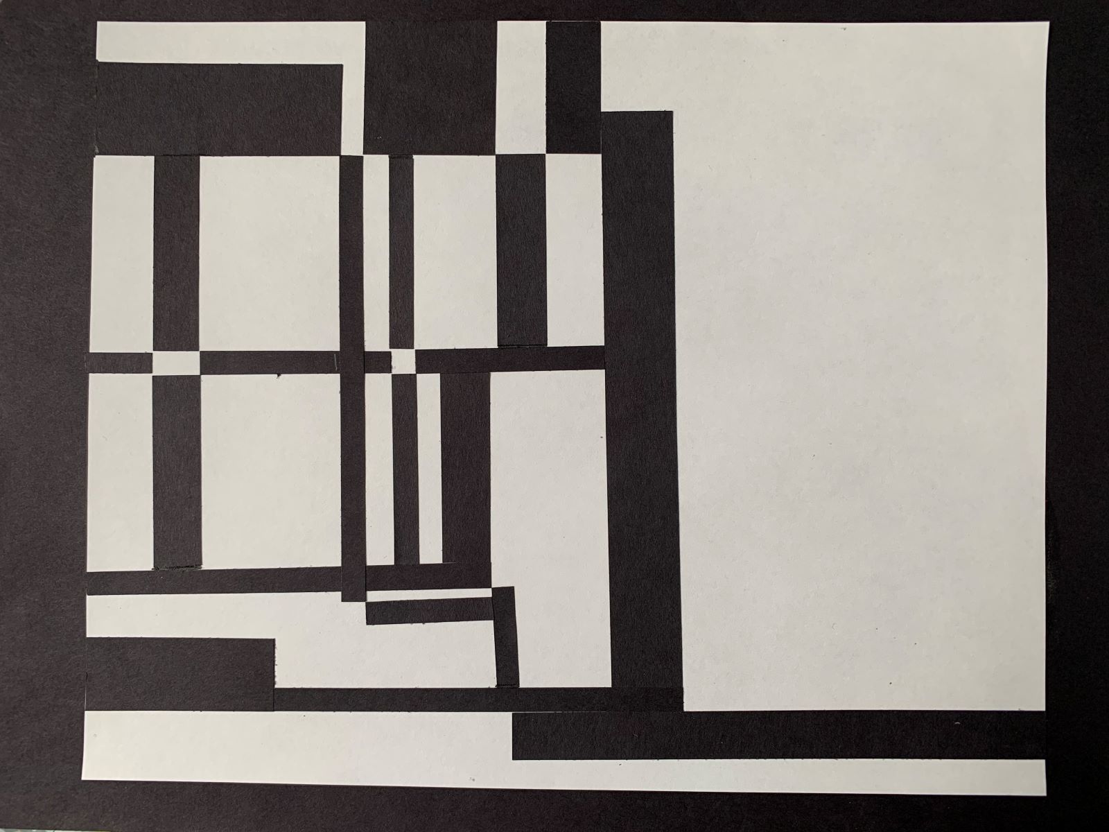
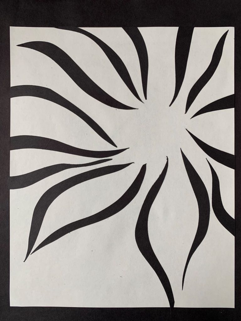
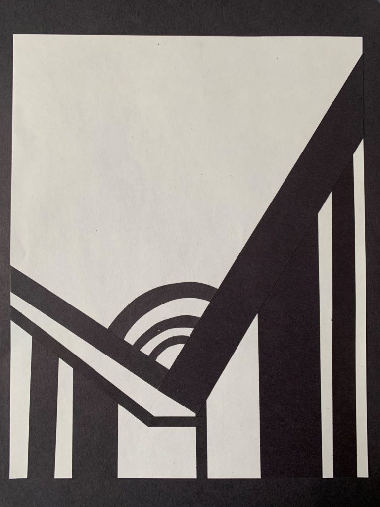
The curved line piece could use a little more development, it doesn’t yet feel complete to me. I think it could benefit from an element of a different scale/thickness. All of your lines are thick and curvy and feel like the “same” so it feels 2D. The mixed design reads as a spacailly dynamic narrative with the diagonals residing in the front most plane. this is the only one that reads as occupying different planes which I think makes it a strong piece in a different way. Im curious how we can develop this idea further.

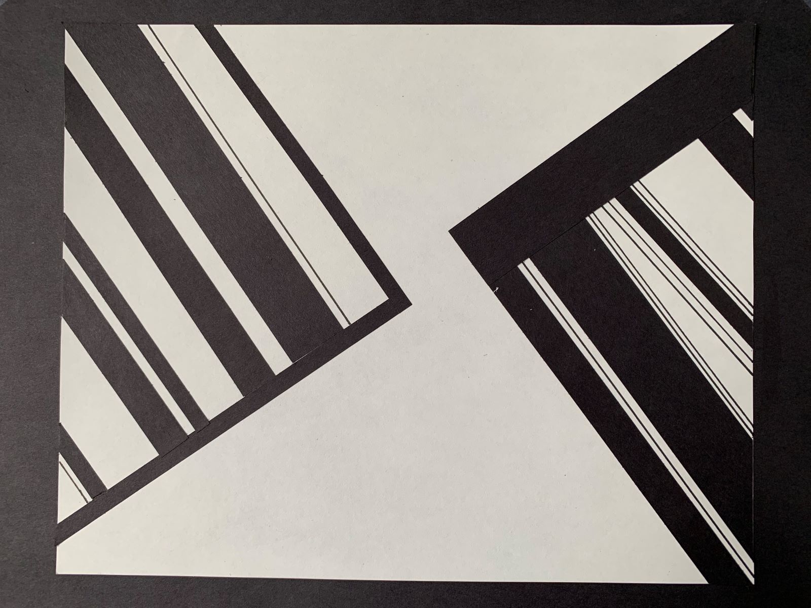
I love the addition of the very skinny lines in the diagonal line design that we discussed. It now reads as a much more dynamic and full pieces, as before it plain. I’m not sure how I feel about the first line in the right triangle being a different thickness that wraps around the corner. I think it reads very nicely in the left triangle when the outside lies are the same thickness. The playing with inverting the black and white when crossing domains in the H/V is new! I like that addition.
The curved line piece could use a little more development, it doesn’t yet feel complete to me. I think it could benefit from an element of a different scale/thickness. All of your lines are thick and curvy and feel like the “same” so it feels 2D. The mixed design reads as a spacailly dynamic narrative with the diagonals residing in the front most plane. this is the only one that reads as occupying different planes which I think makes it a strong piece in a different way. Im curious how we can develop this idea further.
Nice work, Lily. And good job with the photography to avoid distortions.