
These images show my final turnout, but I would love to get feedback specifically on the horizontal/vertical and diagonal line designs because I feel they could be stronger (I kind of struggled on those designs).


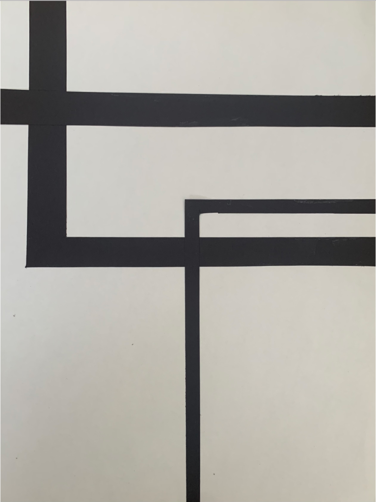
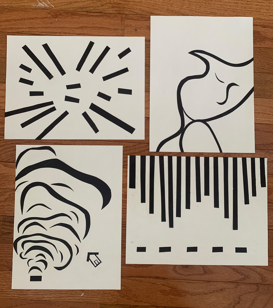
These images show my final turnout, but I would love to get feedback specifically on the horizontal/vertical and diagonal line designs because I feel they could be stronger (I kind of struggled on those designs).
You must be logged in to post a comment.
The compositions will be have a better read with mounting sheet attached since it really activates the groundsheet. Compositionally, the curve design is strongest, but double-check that the groundsheet is 8 x 10. The combo piece also has interesting form and narrative but feels a little crammed on the left side. The diagonal isn’t generating as much interest and the h/v design could use stronger craft.
Hey Brooke, these are looking good so far. For your original horizontal/vertical composition, your creation of the mountains using negative space creates a lot of intrigue, but I don’t think the size and spacing of the vertical lines is serving your idea to its fullest potential. I think distinguishing them from the road lines in size might help create that depth and really emphasize your road-mountain-sky composition. I like how the new one is experimenting a little more with composition and line weight. With your diagonal piece, I might experiment with how these lines blend off the edge of the page. That part to me seems the most engaging. I like the part on your curved piece where the three bends intersect to make a straight line.
Owen