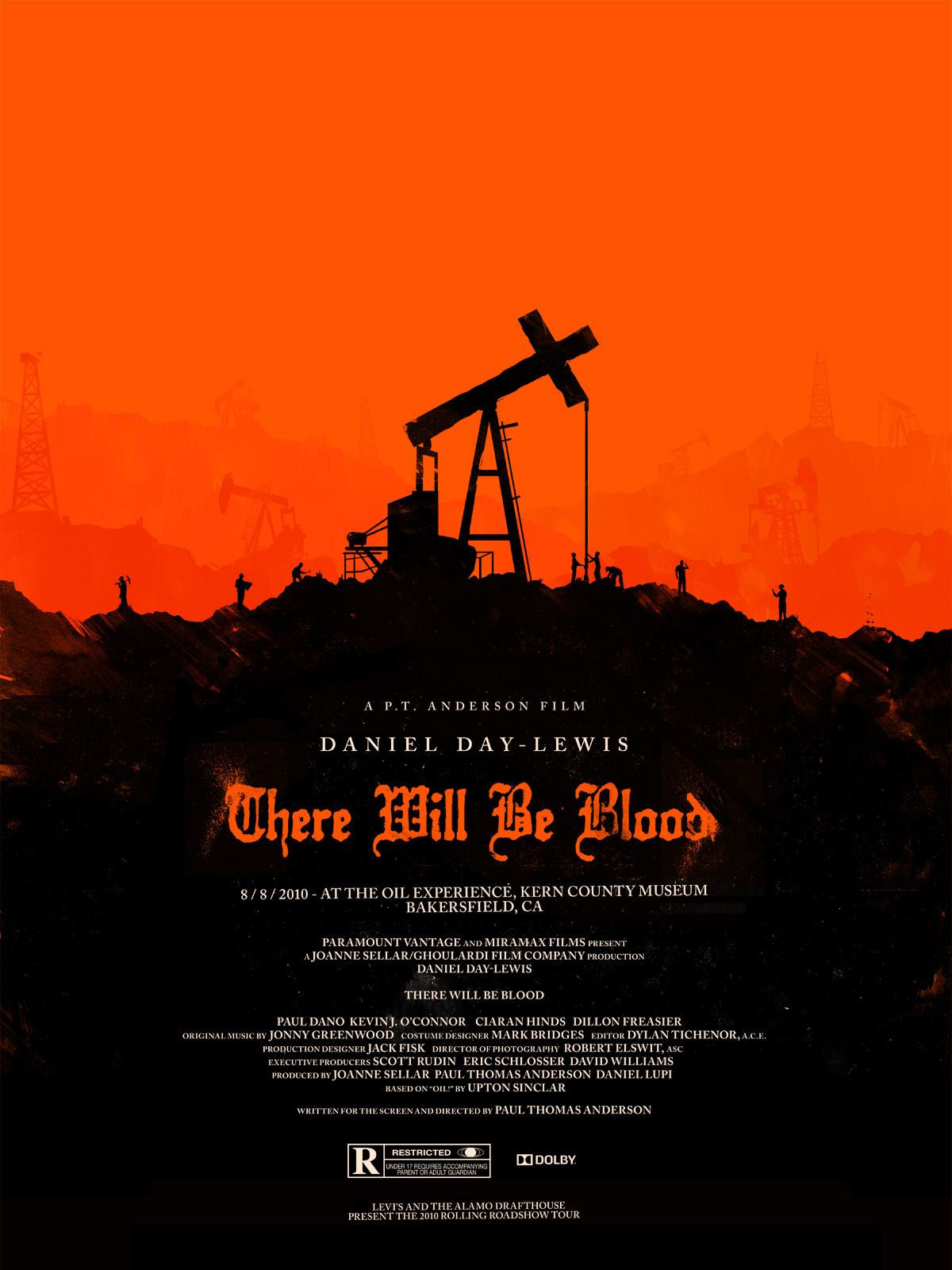
Movie posters represent a significant challenge, tasking designers with creating a graphic, a single picture, which encapsulates the most alluring aspects of the film, a chain of thousands of moving images. Unsurprisingly, Paul Thomas Anderson’s There Will Be Blood, boasts a movie poster to match the expert caliber of the film.
In this movie poster for the 2007 drama, the designers responsible have composed a graphic which uses minimal imagery to large effect. Set against a red-haze background, the focal point is foremost the crucifix form which rises from the base of blackness into its distinct form clashing with its bright background. The form of the crucifix utilizes a centuries old form which is both powerful and immediately recognizable in order to denote a biblical aura for the film. The crucifix form is used in harmonious tandem (showing connection rather than juxtaposition) with that of an oil drilling rig, another central theme in the film. The combining of these two recognizable forms alone informs observers of important themes in the film through visual dialogue, and this information is furthered by three more key elements working in symbiosis: color, text, and typography. I am distinguishing text from typography here because in addition to the design of the words (typography) enhancing the meaning of the text, the meaning of the text enhances the design by establishing a tone.
Ask me any day of the week and I will tell you that a significant portion of There Will Be Blood’s brilliance lies in the title itself. The reason that it remains the most potent example of a movie’s title enhancing the actual picture is because it sets a tone for the film before we even see it. One of the many ways we are alerted of a movie’s existence is seeing its poster mounted outside of a theater. Here, the text “There Will Be Blood” reveals a significant tone for the film, which not only compels us to view it, but also alters how we experience it once we do by instilling us with an anticipatory suspense. This foreshadowing in the text is aided most powerfully by the employment of the color red. In its typography, whose print style channels the movie’s early nineteen hundred’s setting, blood splatter is disguised as messy pressing of ink from old-timey typesetting, so that the title itself takes on the characteristics of the word “Blood”. Red and black is a powerful combination, often associated with the likes of Satan or hell. That evil color scheme clashes with the religious sanctity of the crucifix form, alluding to yet another theme in the film. The human silhouettes are tiny in comparison to the cruciform drill, as scale is used to establish a hierarchy where the crucifix form embodies the status of a higher power, which by association elevates the oil rig to which it is joined to the same status as God in yet another eerie premonition of the film.


For future posts, don’t forget to use the gallery block for images and set the featured image.