
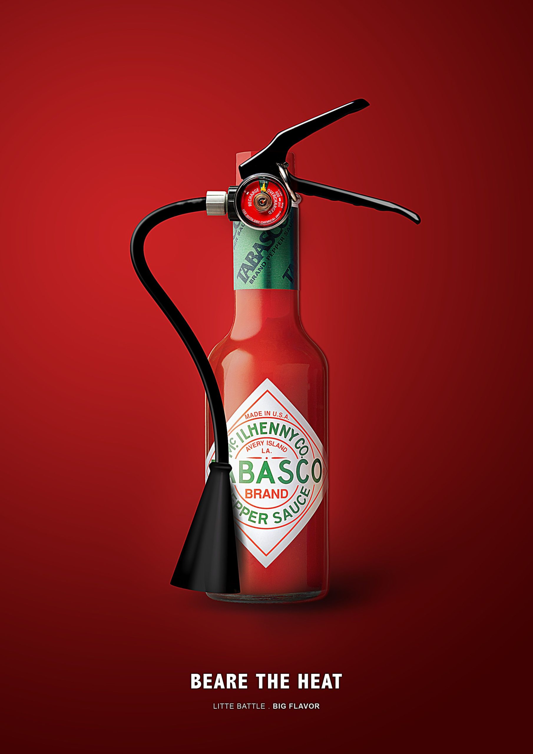
This advertisement of Tabasco caught my eye when I was searching for advertising graphic design. Tabasco is a brand of hot sauce made from tabasco peppers. It is produced by McIlhenny Company of Avery Island. This advertisement uses proximity. The red Tabasco bottle resembles the red cylindrical tank of a fire extinguisher, so the designer combines them together. It is very interesting that a fire extinguisher would put down the fire while a bottle of Tabasco seems to create “fire” in our mouth. The sense of humor not only directs the viewers to associate Tabasco sauce with fire, but also leads us to imagine how the spiciness would explode in our mouth with a small taste of Tabasco, just like the dry powder spraying out from the fire extinguisher. Just like the words on the advertisement says, “beware the heat” of the fire-like Tabasco.
The design is very detail oriented. The longer you stare at it, the more interesting details you will find. The pressure gauge on the fire extinguisher points to the green area between “overcharged” and “recharge”, implying that the Tabasco sauce has just the right amount of spiciness to cater to customer tastes. The nozzle of the fire extinguisher is enlarged, emphasizing the strength of spiciness.
The use of color is also eye-catching. The advertisement uses contrasting color, such as red and green, and black and white to create a bold, shocking impression. The main color red conveys a sense of spiciness, heat and danger. The designer also considers the psychological aspect of red color. Red can increase metabolism and stimulate appetite according to study, so the red advertisement could imply customers to try Tabasco.