
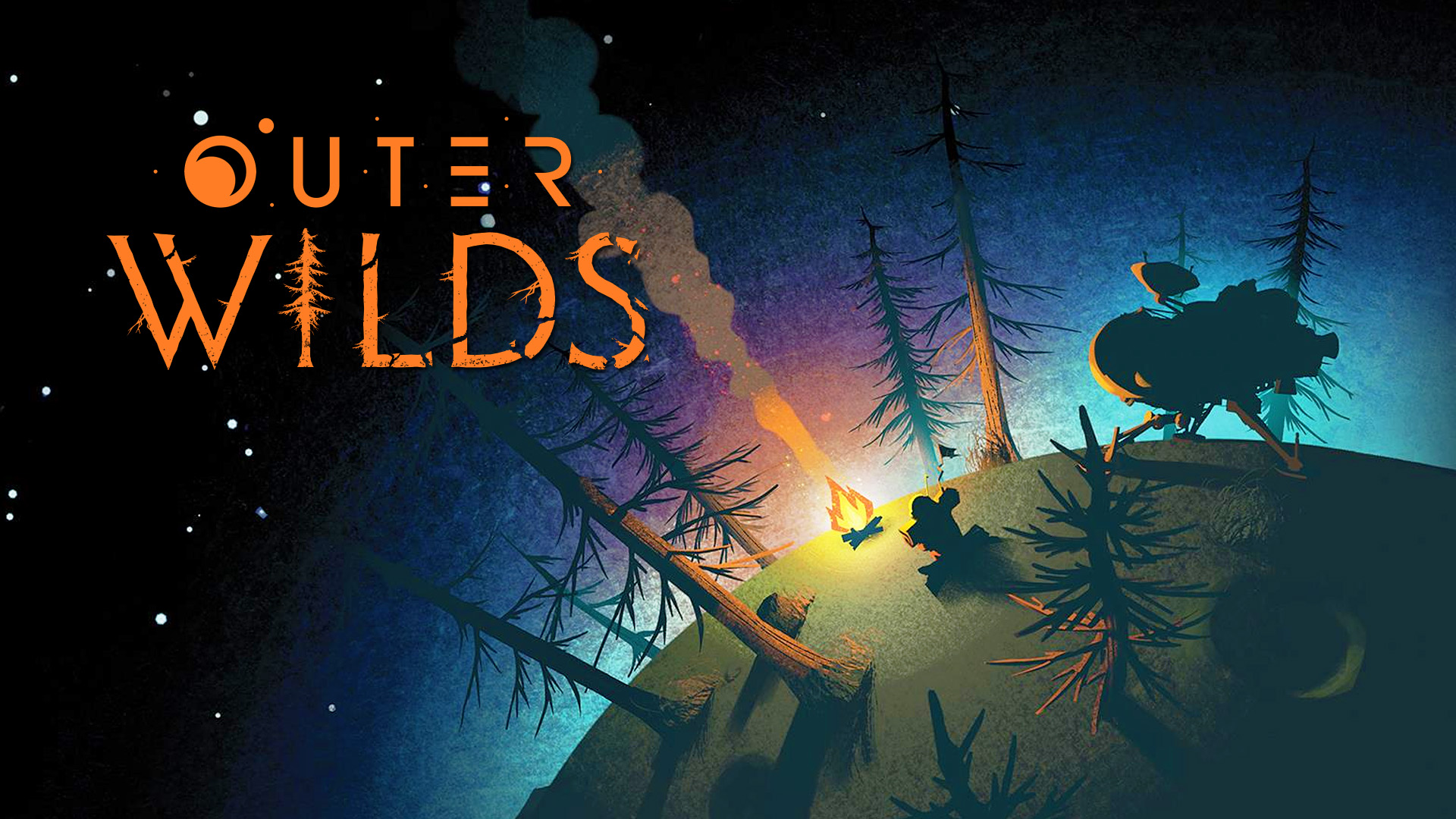
This promotional poster, which doubles as the cover for the soundtrack, provides a great glimpse into the video game “The Outer Wilds.” The light of the campfire invites the viewer to a cozy experience, while the spaceship nearby implies an adventure through the stars. The logo further stresses this intersection between folksy and science fiction with its minimalist “OUTER” and forested “WILDS.”
Color and shape play a huge role in making this poster appealing. Contrasting the warm-toned fire is the cool-toned gradient of light surrounding the small planet. This works to highlight the dark planet against its black background, as well as to draw the eye down into the camp without taking away from the focal point of the fire. Meanwhile, the dark silhouettes of the trees, astronaut, and spaceship are clear and defined, so they are easy to read in their simplified state. The planet’s shape also has a story to tell. Its continuous curve suggests a very small planet, which allows us to see the camp and the space outside of it in greater detail than we would be able to otherwise. If it were a larger planet, then the camp would have to be much smaller, and we would start to lose the emphasis on what the game really is. By seeing the curve, the poster emphasizes space travel rather than camping in a forest. Therefore, we read the camp as a temporary, cozy break from space exploration, which is accurate to the game itself.