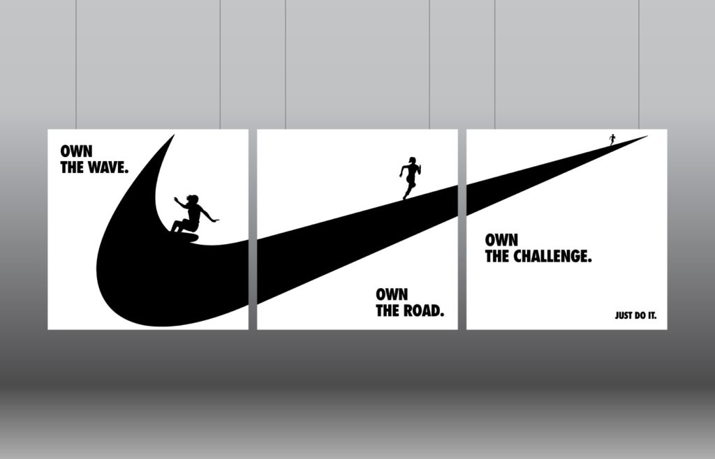
This is an ad I found from Nike that I thought would be a great example for the design write up exercise. I was drawn to it initially because of the creative use of the logo and how they used the highly recognizable image to create three different perspectives and resulting stories. I also thought that the ad had a creative design because I thought it represented the brand well, by highlighting different sports and how nike can be apart of many different athletes routine.
In terms of a critique, I thought the use of the logo to create different proportions and places in space was creative as well as using three different subjects along it that when they come together you can see that the one thing that they have in common is the brand.
For different elements of the design I liked the simplicity of just using black and white because it highlighted the shapes and figures of both the logo and the subjects in each section. In the end I thought the ad was successful in telling a story.


