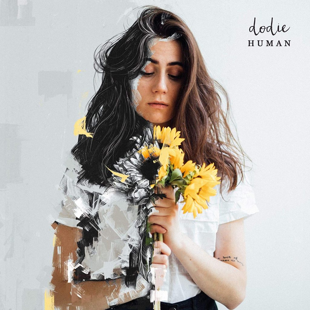
dodie is an amazing artist. EVERYONE should check out her music. This album cover is just a tease for all of the beautiful songs within it. There is so much to unpack here, and it all works wonderfully together.
Composition
dodie is placed standing vertically in the center of the artwork, and takes up about one third of the space. In the very center of the piece is a bundle of bright yellow flowers. It is very easy to figure out what to look at since the most detailed aspects are centered. There is a decent amount of empty space to the left and right of dodie. Though on the left, that space is filled with texture. In the top right corner is some text. The text feels a comfortable distance away from the top and side, though I do not know how to explain why it looks nice.
Color
I don’t know much about color theory, but I do know that ratios of colors have a major impact on attractiveness. There are only about five dominant colors in this photo, but each one plays its own role. The most apparent color is clearly white and gray, taking up more than half of the picture. The second most dominant colors are her skin and iconic hair. Whithout these colors she wouldn’t look “Human,” so her skin is minimally altered. The next color is black. To me, it feels like the black shadows, paint strokes, and pants give definition or depth. The yellow shown here is the same shade of yellow that appeared in her two previous albums. The yellow is second least evident color, yet it sticks out the most. The final color is green. Though there is barely any visible green, without it the cover would look unwelcoming and much colder. It relieves some stress since green can be associated with nature and freshness.
Text
The text is placed in the top right corner. The “dodie” is written as her signature, while the “HUMAN” underneath her name is in an antique, typewriter-esque font. This very much fits her old-timey english aesthetic, adds more character into the cover, and further pushes “Human” idea.
Miscellaneous
The background has a very slight gradient, with the brightest point being at the top right very close to the text. This also appears to be the direction the light source is coming from. The bits of yellow paint strokes that look like they are lifting off of the cover tell us that the color is being taken away from dodie, not the other way around. This “color stealing” effect also splits the artwork directly in half, only leaving dodie’s face with color in the middle. I believe her arm was also left with color because of the same reason stated earlier: if her skin was different she wouldn’t look “Human.”
This cover is amazing, and so much about it just works. I don’t know how to explain how so many of these things work so well together, but each feature is undeniably deliberate. Why is she holding the flowers like that? Why the white background and shirt? Why be directly in the center? Why make the album title so small? There is so much to question!


