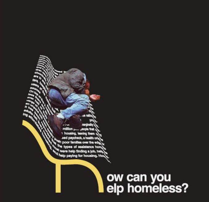
I chose this graphic design piece because of its creative linework, and the overall message it explores. Before I talk about this, I would like to say that my interest in this piece was heightened because of my past experiences with homelessness. I think it’s important sometimes to pick and choose how you portray yourself to others, and for me, it is important to talk about the things that define me.
Let’s just take a moment to fully analyze what’s going on here:
This Graphic Design piece was made by emrahkara on deviant art and partnered with a homeless advocacy organization called Alerta Livestock, Innovative Advocacy. Specifically, one thing that pops out is the use of the two-point perspective of the bench. The contours of the bench create a warped, curved, and foreshortened block of text, completing the shape. The color choice of the block of text in contrast with the background further exemplifies its existence on the plane itself. The placement of the man laying down on the words helps further comment on the significance of a bench and the significance of the paragraph itself. The paragraph is warped so it is difficult to read, but some of the legible words include “poor” and ‘housing” which all blend into the topics about homelessness. It could be inferred that this photo was a picture of a man sleeping on a bench, and then photoshopped onto this graphic designed bench.
One thing that I find really eye-catching is the bench frame. I believe this is a successful strategy because due to its smooth, curved shape, which guides the eye from left to right, diving right into the question “How do you help the homeless?”. I believe that the use of curvature and the position of the question next to the bench frame makes the composition cohesive. The color choice in contrast to the background helps emphasize key areas such as the bench frame and the question itself.
Overall, I think this composition is really successful in terms of positioning of the bench to the question, giving readers a way to interact with something just with their eyes. The font is appealing and is curved, and the use of warping of text gives the design a realistic and simplistic embodiment. Lastly, as important as homelessness is to me, I think just the general creativity and ideology behind this is really insightful and worth the recognition.


