
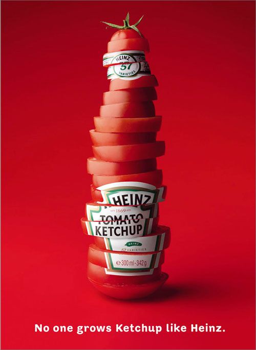
In all honesty, I do not like ketchup, but I like the color red and that is what drew me to this ad. Looking at it, the first impression you get from this ketchup ad is that it’s very simple and basic. However, on second glance, the ad is smart in ways that it uses ketchup’s main ingredient tomato to resemble the typical Heinz ketchup bottle. Furthermore, the tomatoes are in slices and are not perfectly placed in a bottle form. This adds to the humbleness of the ad. Speaking of humbleness, the color choice is essentially one note and the font of the one sentence is simple as well. There is only one subject in the ad and it is centered. All of your focus will go to the bottle before reading the bottom line. This ad is successful in delivering a straightforward message which is that Heinz is exceptional at making ketchup.
“No one grows Ketchup like Heinz”. This claim is almost kind of arrogant and juxtaposes the humbleness of the image. Though, with the red color, one subject, and one line, it is easy for ketchup to be associated in your mind quickly. This ad is transparent, but the bottle figure being shaped by tomato slices and using the word “grows” can be somewhat misleading. Right away when a brand uses the word grow, I assume that the brand’s product is organic or healthy. Even more, the bottle figure only consists of tomato slices and none of the other ingredients in ketchup. Of course, this choice is to make sure the consumer knows Heinz’s ketchup is majorly made with tomatoes. Heinz is not claiming that they grow their own tomatoes, but the design is effective in making you think Heinz is great at what they do: making a better ketchup than other competitors. One thing to note is that the k in ketchup is capitalized. Again, this emphasis is to help deliver the clear message on what the product is. Though, by doing so, this makes Heinz ketchup appear to be more “fancy” and beyond.
Texture wise, the tomatoes look nice, fresh, and real. The bottle is 3 dimensional, since there is a shadow coming from the bottle. The background as well has some shadow and helps with the color profile and keeps the color red from going flat. Using red as the main color will definitely make the ad stand out and uniform with its ketchup theme. If the background was a different and brighter color, the focal point would be taken away from the bottle. The format is pretty much vertical and the content of the ad is literal.
https://i.pinimg.com/originals/65/88/b3/6588b31c6fe987c548e58ac23c565969.jpg