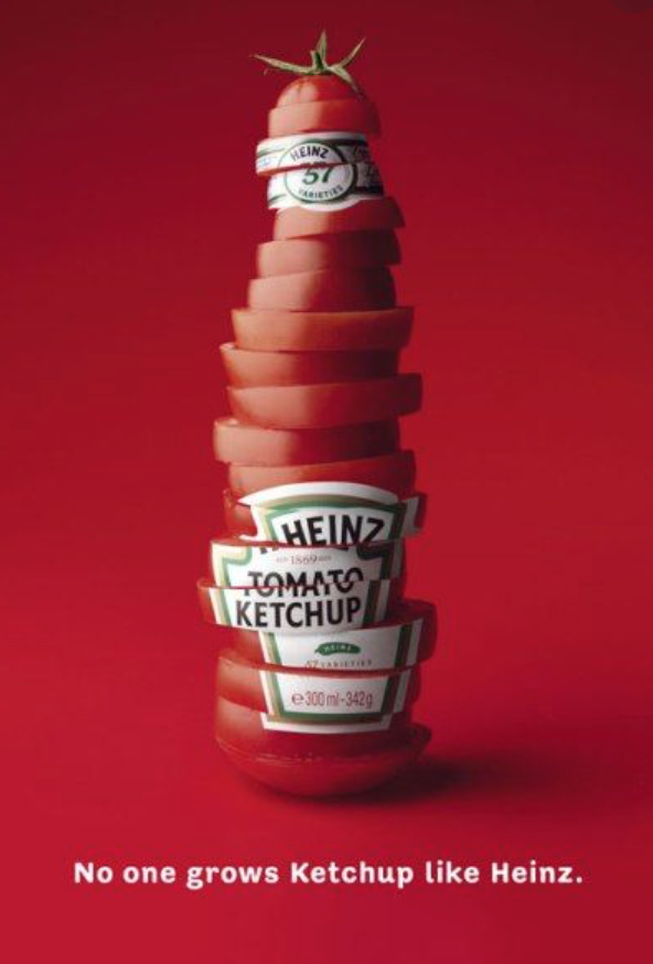
In this example of two dimensional design, juxtaposition is used to portray the idea that Heinz’s product is made from real, fresh tomatoes. We can simultaneously the visual of the Heinz ketchup bottle and the tomato slices. The layout is overall symmetrical, but the way the tomato slices are stacked makes it more interesting and appealing to look at. The visual with this simple phrase is successful in portraying the freshness of the product in a way that is easy to understand, but is also kind of thought provoking and interesting.

