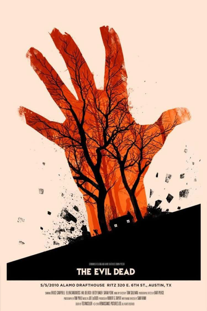
I want to talk about the poster for the movie, “The Evil Dead”, designed by illustrator Olly Moss.I am first intrigued by Moss’s use of negative space, which occupies half of the page in addition to the main subject. By choosing a neutral color, Moss seems to hope to draw audiences’ attention to focus on the rising hand at the center. Also, this fading pink seems to be derived from this rising reddish hand, to show off the dominating impact of the hand on its surroundings, while offering a sense of bloody and horrific to viewers.
Another thing I find very interesting is that the designer seems to deliberately integrate the gloomy trees into the bloody hand by extending them to finger and adding twisty lines, just like the branches are actually the blood vessels of the hand, which shows off the controlling power of this hand, and indicating the worrying destine of the house and people inside.
While the bottom part of the art seems to be put with a complimentary for contrasting purposes.
On the one hand, this black seems to indicate a static, nighty, quiet atmosphere, comparing to the sudden rising hand with the spurting rocks around to emphasis the power and abruptness of the crisis. On the other hand, all the house, trees, and ground are intentionally put in black to create a subtle bloodcurdling feeling and seems to forebode that they, especially the house, are covered under an ominous shadow.


