
Angles was released in 2011 by The Strokes. While choosing a design piece for my write up, I was immediately drawn to this album art.
Beyond my personal devotion to The Strokes, this album cover is so unique and eye-catching. At first, it appears complex, but as you break it down, you can see how basic elements come together and make it so amazing.
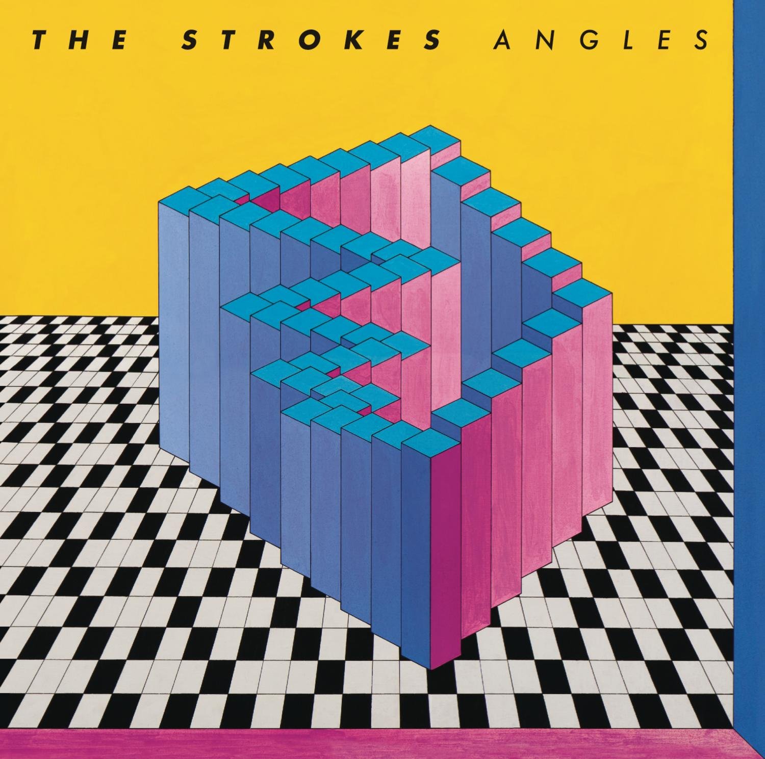
The album art uses geometrics to create a room of rectangular prisms, all of varying height. Underneath this is a black and white checkerboard/floor tile pattern. The floor appears to be angled in such a way that the viewer is looking from above. The center “room” is chaotic and does not align with the floor, despite having the same base shape.
The color is my favorite part of this design. The black and white floor allows for the room and sky to be the focus of the viewer’s attention. The room is composed of cool colors, and above the horizon line is a warm, bold yellow. The rectangular prisms all display a different color based upon the angle they face. On one side they display different shades of blue and on the other they display shades of magenta and pink.
The room could possibly represent an individual. We each have different sides of ourselves that we may choose to show or hide at certain times. Depending on the moment, maybe one second we are blue and the other we are magenta.
The artwork for Angles is by the late Belgian artist Guy Pouppez. The piece is believed to date back to the 60s/70s.