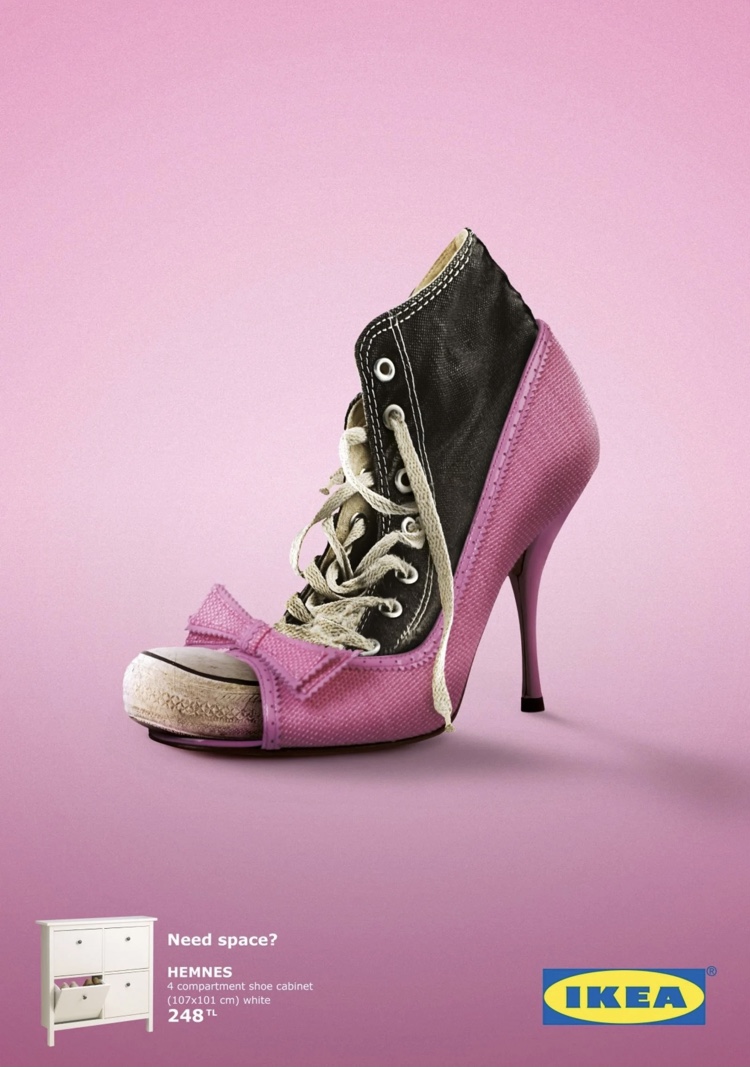
I found this advertisement for Ikea to be very eye-catching. The image features two very contrasting shoes; a pink high heel and a beaten up converse shoe. These shoes could not be less similar and represent all the different types of shoes someone might have in their closet. At the bottom of the ad, there is a simple Ikea label along with a picture of a shoe cabinet and a two-worded phrase, “Need space?”. I like the simple design of the advertisement; by limiting the imagery and colors, the artist was able to get their point across with minimal text. The pink background keeps the advertisement eye-catching while the white glow around the shoes creates contrast and brings the eye to the center of the page. Overall I think this is a powerful marketing image.

