
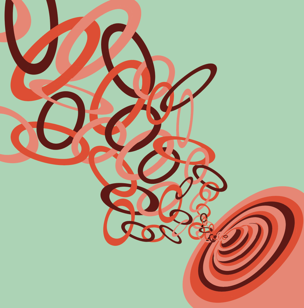

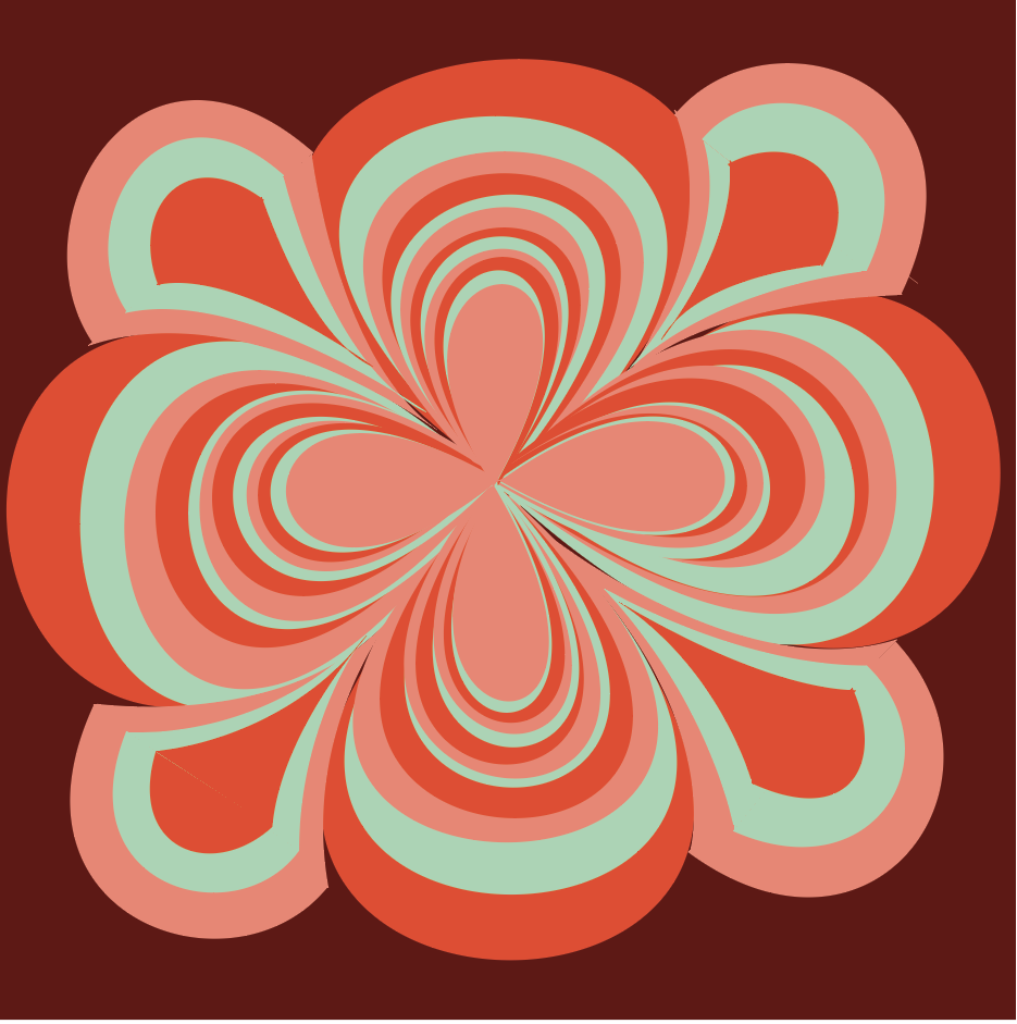

These are the edits I made following critique- I decided to go with an entirely different color scheme, as I realize my last one lacked contrast and wasn’t making the designs pop the way I wanted them to. I used the color harmony feature and played around from there to end up with this.
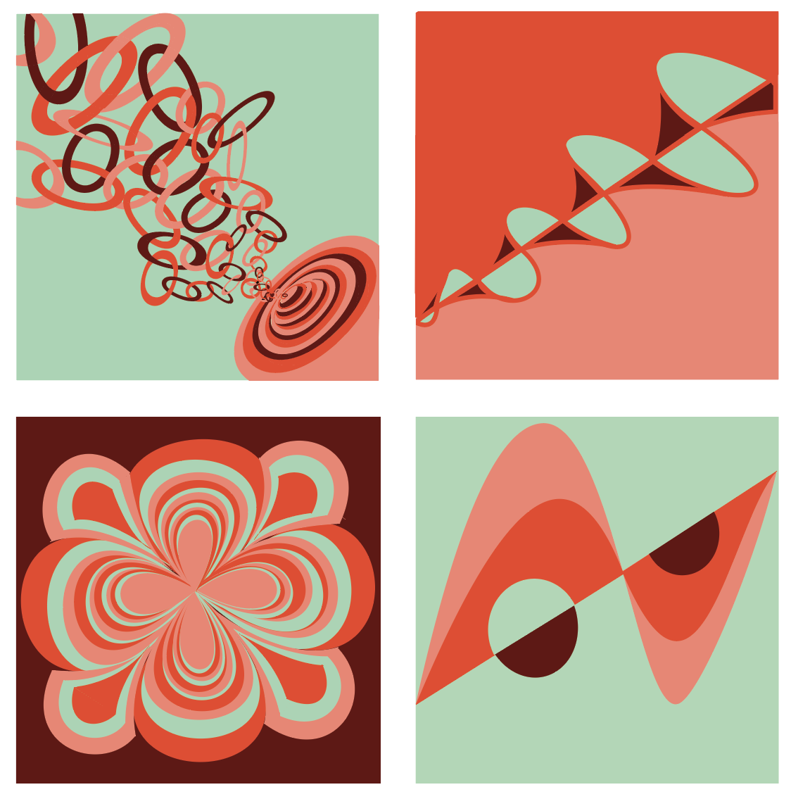
This palette worked out great. Nicely done!